← Tools
 Eugene Arutyunov
 Ilya Sinelnikov
There has to be a square element
The logo needs a square element alongside the wordmark; without it, we have to make up a new icon for every platform, app badge, profile picture, etc., which hurts consistency. A built-in square mark gives us a clear, repeatable icon wherever a square format is needed.
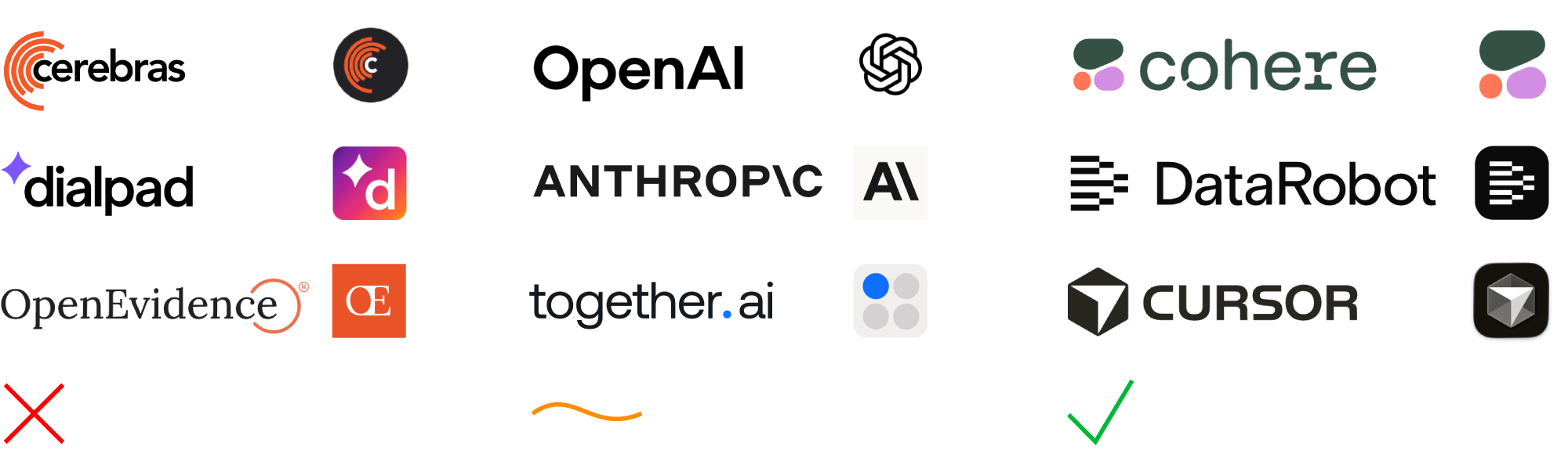
The logo doesn’t solve the icon problem — it forces a new symbol to be invented each time, which breaks recognition and consistency.
The logo is just text, so a separate symbol ends up serving as the icon — like OpenAI, where Blossom isn’t part of the logo but inevitably becomes the main identifier.
The logo includes a square symbol, which naturally becomes the default icon whenever a square format is required.