← Blog
 Eugene Arutyunov
Five Requirements for Icons
Here are the requirements usually applied to icons:
- Convey meaning.
- Form a system.
- Be distinguishable from each other.
- Integrate into text and interface.
- Convey the product’s image.
Let’s break down these requirements one by one in more detail.
1. Convey meaning
You can think of an icon as a shorthand way of writing other words, something like a hieroglyph. The icon’s superpowers: compactness, built-in localization. The limitation: unfortunately, very few words and concepts can be reliably encoded as icons within a single language environment. Universally understandable ones are even rarer.
What’s usually done about it (and we do the same):
— in critical places, the meaning gets labeled with words
— the audience is gradually taught the product’s icon “dialect” (“here’s
what this icon means specifically for us”), while avoiding obvious
conflicts.
2. Form a system
If you just throw together a random set of graphic thumbnails, each conveying its own meaning, they’ll be hard to perceive as a whole. This isn’t only about aesthetics — differently styled images are obviously noisy and confusing, but there’s a functional side too: a contract with the user.
Any system implies something like an agreement about what can and can’t appear on a page, in an interface, in a user flow. This predictability makes complex things feel simpler, and people get frustrated less and trust the product more.
So we keep the set to a few basic constants: how much line thickness and spacing between objects may vary, what level of detail is acceptable, and solid fills only — no outlines. Where a line is needed, it is thick, and technically it is a fill too.
3. Be distinguishable from each other
If icons are made too similar to each other, they turn into noise. You can compare this to alphabets: it’s good when an alphabet has letters that look like S, I, A, R, or O — it helps reading; it’s bad when you get something like Н, П, Ц, Ш and Щ, as in the Cyrillic alphabet — that doesn’t help at all.
Obsessing over modularity, over-unifying shapes — this is the most common mistake and the main problem with most modern icon sets. It mostly comes from icons being designed and “sold” outside their real context, laid out neatly like candy in a sweet shop. Real-world conditions demand much more diversity. So we make icons that are consistent in character but very different in shape.
4. Integrate into text and interface
Literally, this means: icons should shrink down to letter size (okay, maybe a bit bigger than a letter, but comparable) without losing functionality, and scale up just as painlessly — the same icon should hold up whether it’s a 16×16 favicon or a 200×200 illustration on an empty state screen. They should also become monochrome without any issues.
Velma’s ELM architecture transcends traditional LLMs to interpret emotion, behaviors, tone, intent, and context to unpack the full meaning of every conversation.
Our preferred version may be in color, and the monochrome one may say a little less (the deepfake icon leans on color for its meaning) — but it must not fall apart or turn into a different icon. Most of our icons are monochrome to begin with; not all of the colored ones survive the switch painlessly, and that is a known problem we still have to solve.
This is our current set. Not perfect — but it tries to keep a balance between all the requirements listed above.
5. Convey the product’s image
A carefully drawn icon can create a feeling of “something interesting, thoughtful, and well-made is waiting for you here.” This approach is mostly typical for app icons — like in iOS.
In the Modulate design system, icons originally appeared for dashboard navigation, and they were small to fit into a line. We made model icons using the same recipe, also for navigation.
But then the Pricing page grew, and to keep the spec tables from all looking the same, we needed clear visual accents. So our simple icons grew to iPhone-icon size. And honestly, they didn’t quite meet the requirement of conveying the product’s image.
So we came up with 3D versions for them:
And since these signature icons are going to be needed in many different contexts, we built a flexible tool for making such pictures: the angle, the backdrop and the lighting are all adjustable, within limits that keep the icons looking right.
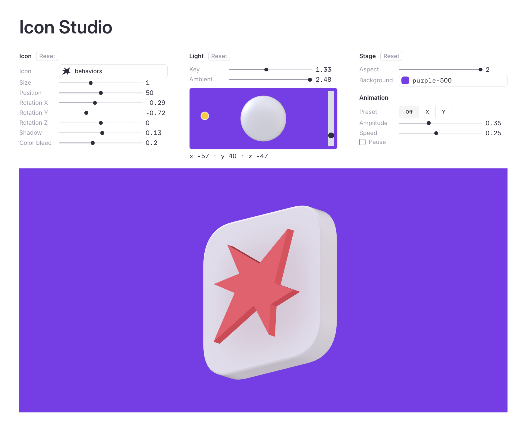
Try it: Icon Studio.
Read next: Every Conversation Leaves a Fingerprint