← Blog
 Eugene Vlasov
UI Scheme Tool: Source of Truth and Consistency Keeper
We’ve had a UI Scheme for a long time, maintaining it by hand as the product evolved. It records the intended structure of our interface: which screens belong in the product and how they fit together. It’s our shared source of truth.
That matters because we design directly in prototypes. The development team can also build and deploy a change ahead of design — a freedom the team should have by design. Neither the prototype nor the live product alone can be the definitive reference for the intended structure. The UI Scheme is where we keep that shared picture.
Keeping the map current is only part of the job. We also need to check how the live product matches what we intended. UI Compare brings that review alongside the scheme, so we can see what needs attention and keep the findings connected to the product.
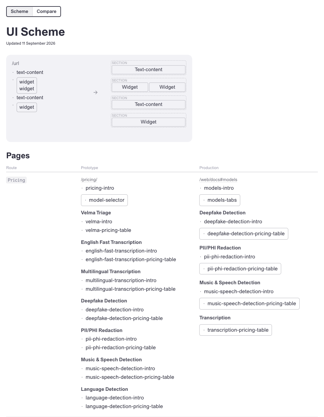
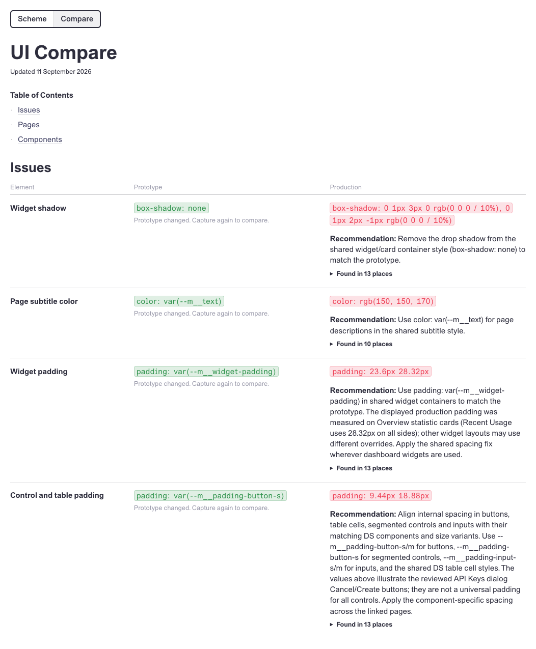
We maintain the shared reference for how the interface should work, and check the live product against it. That gives anyone at Modulate a place to see what’s intended, where the experience differs, and what we recommend changing. Small discrepancies deserve attention too: a repeated problem can affect how the whole product feels.
Of course it’s automated — an AI agent gathers the evidence and keeps the map and review up to date. We use the review to decide which differences are intentional and which need fixing. Each decision helps refine the agent’s instructions about what to look for. That means we spend less time repeating manual checks and more time improving the experience: quality becomes part of the routine.
Consistency builds trust. When familiar controls behave the same way and screens feel like parts of one product, people spend less effort figuring out the interface and feel more confident using it. Fixing the shared problems found during review brings that consistency to more screens, and small improvements add up to a product people can depend on.