UI Compare

Updated

Issues

ElementPrototypeProduction
Page subtitle colorcolor: var(--m__text)

Prototype changed. Capture again to compare.

color: rgb(150, 150, 170)

Recommendation: Use color: var(--m__text) for page descriptions in the shared subtitle style.

Found in 9 places
Control and table paddingpadding: var(--m__padding-button-s)

Prototype changed. Capture again to compare.
padding: 9.44px 18.88px

Recommendation: Align internal spacing in buttons, table cells, segmented controls and inputs with their matching DS components and size variants. Use --m__padding-button-s/m for buttons, --m__padding-button-s for segmented controls, --m__padding-input-s/m for inputs, and the shared DS table cell styles. The values above illustrate the reviewed API Keys dialog Cancel/Create buttons; they are not a universal padding for all controls. Apply the component-specific spacing across the linked pages.

Found in 13 places

Pages

RoutePrototypeProduction
Pricing
Prototype: Pricing, default

Prototype changed. Capture again to compare.
Production: Pricing, default
  • Model icons — Production uses different icons; the prototype uses the 3D model icons.
  • Model tables — Typography and spacing differ from the prototype tables.
View data diff

The header differs because production is captured signed in and the prototype signed out.

The model catalogs differ: the prototype adds an Analysis group (Velma, Velma Agentic) and more Triage, Transcription and Detection entries. Confirm the current catalog before treating these as defects. Prices, limits and supported languages also differ.

Captured 30 September 2026 with field replacement before rendering; names, emails, organizations, IDs and account values use synthetic values.

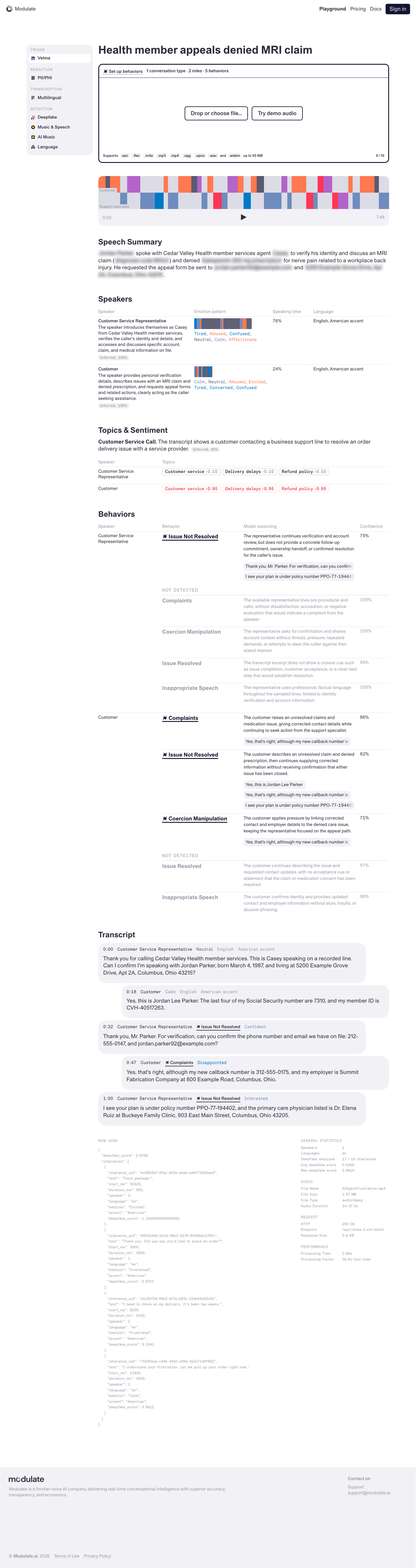
Playground — Velma Triage
Prototype: Playground — Velma Triage, default

Prototype changed. Capture again to compare.
—

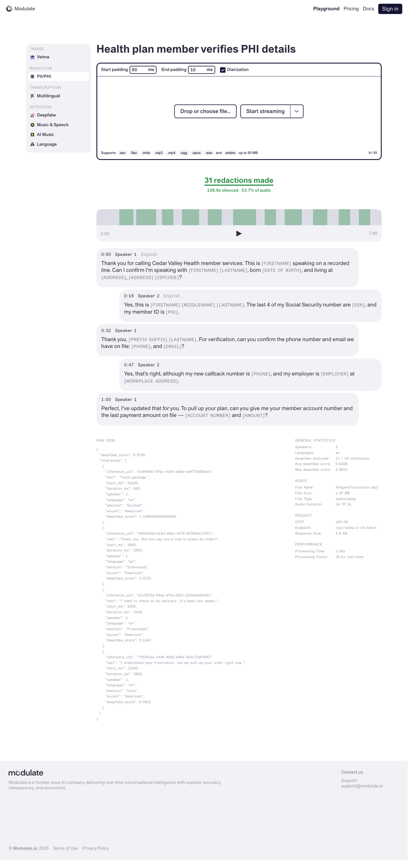
Playground — PII/PHI Redaction
Prototype: Playground — PII/PHI Redaction, default

Prototype changed. Capture again to compare.
—

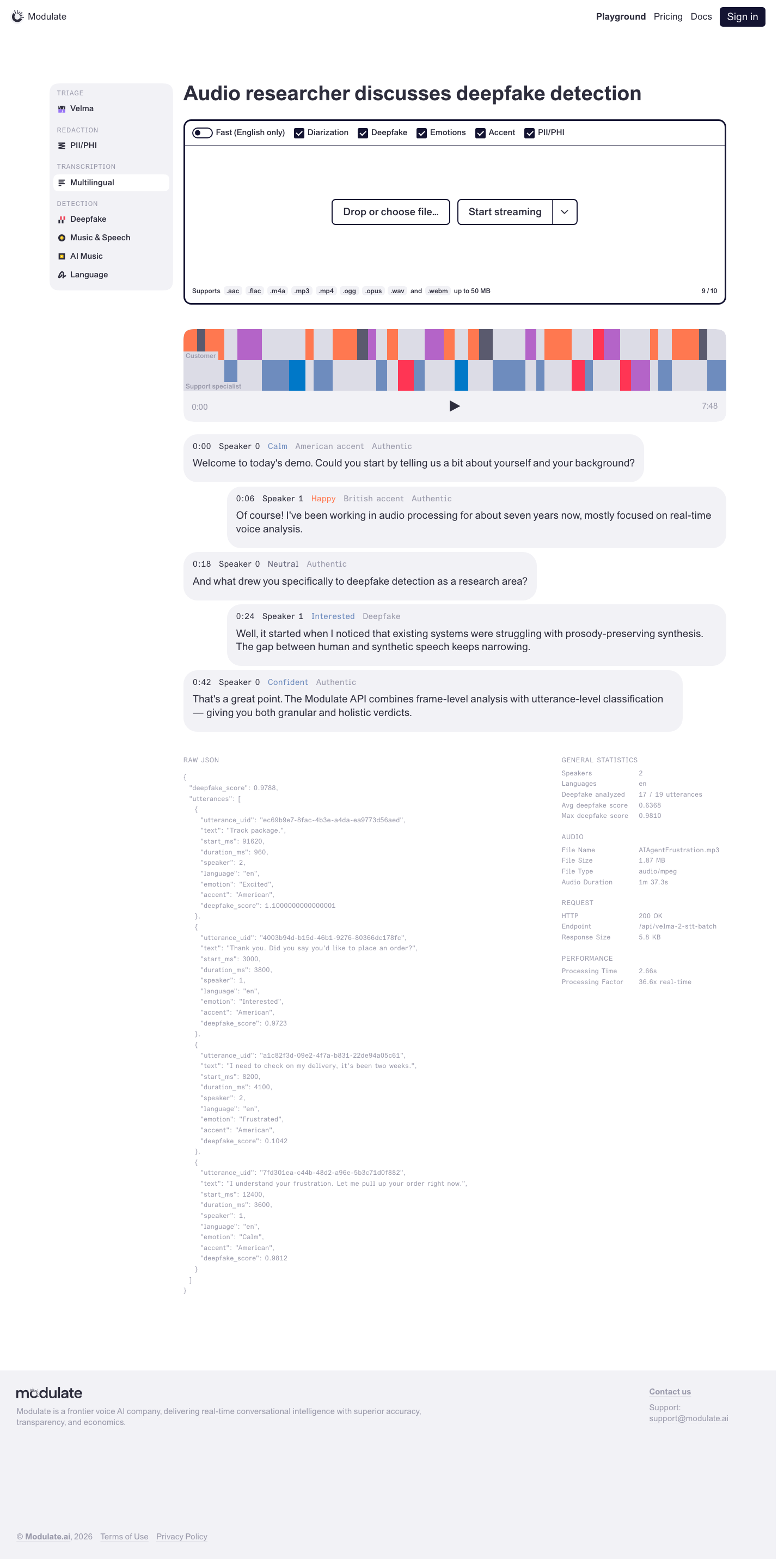
Playground — Multilingual Transcription
Prototype: Playground — Multilingual Transcription, default

Prototype changed. Capture again to compare.
—

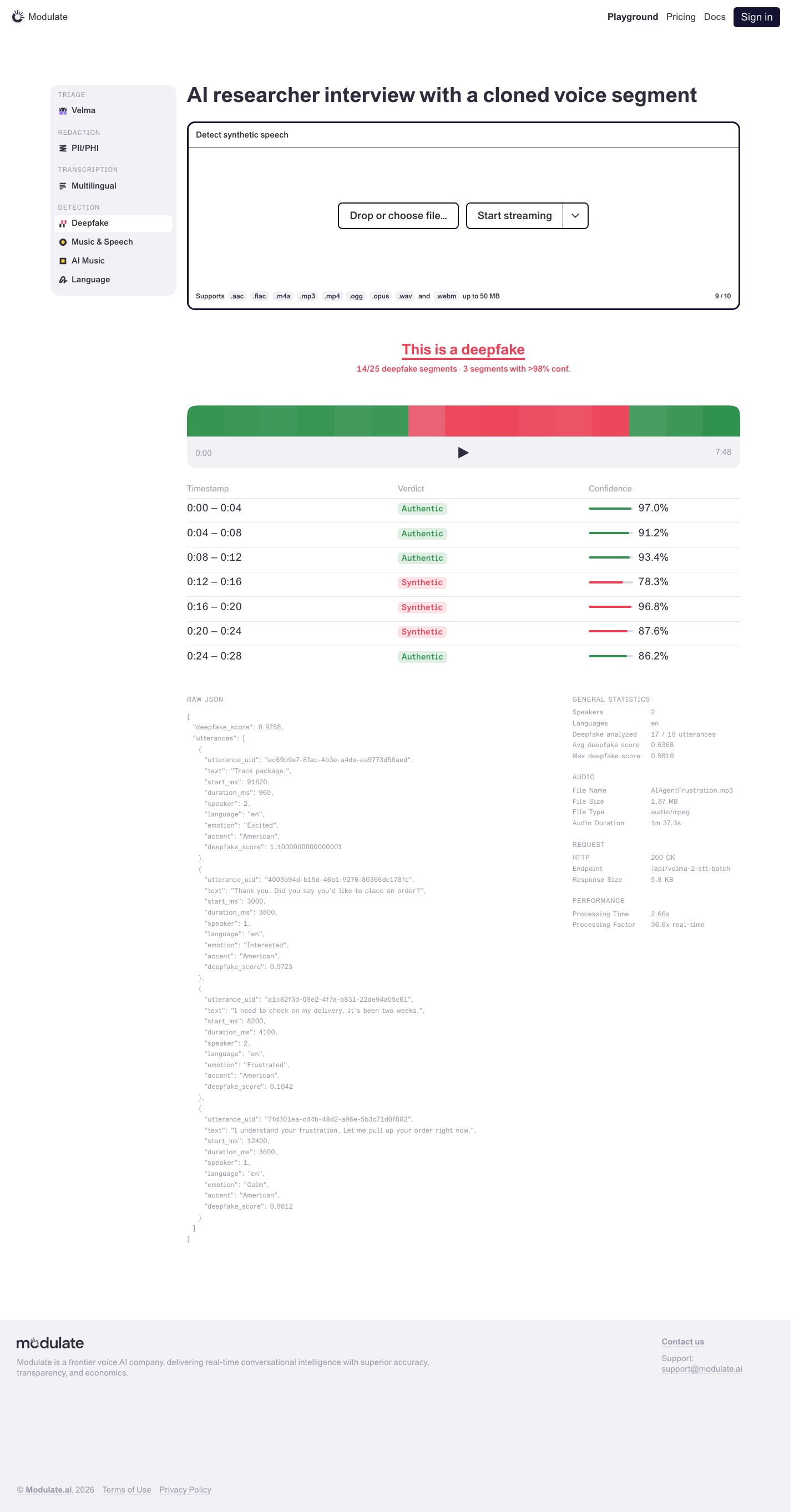
Playground — Deepfake Detection
Prototype: Playground — Deepfake Detection, default

Prototype changed. Capture again to compare.
—

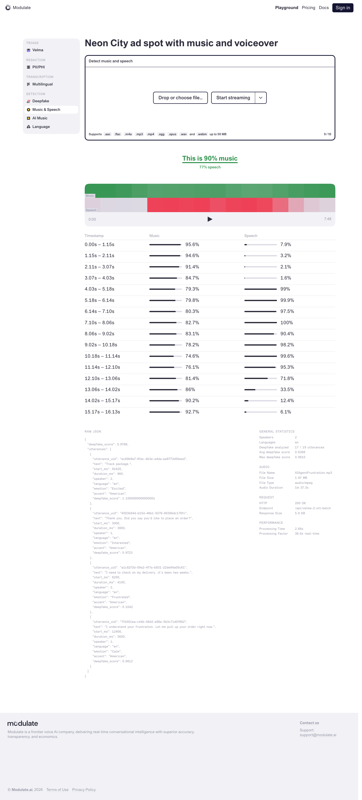
Playground — Music & Speech Detection
Prototype: Playground — Music & Speech Detection, default

Prototype changed. Capture again to compare.
—

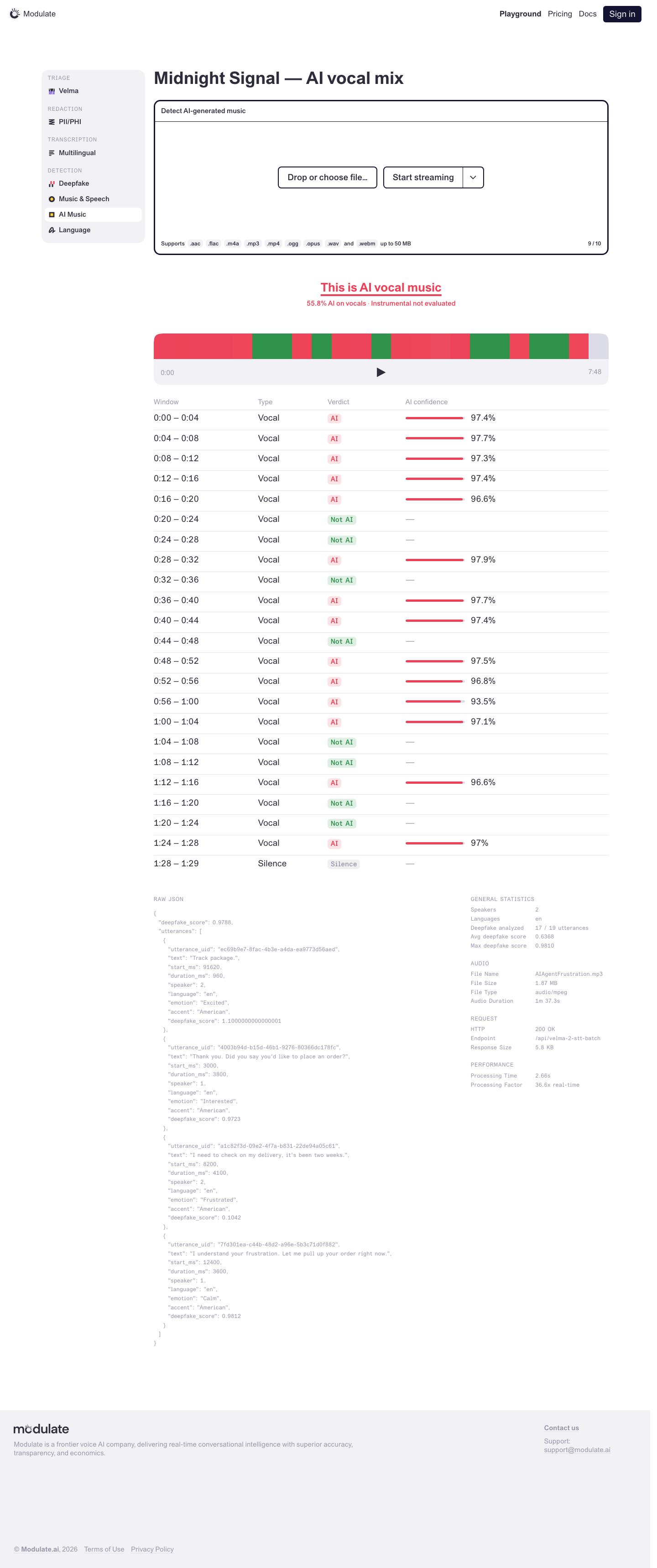
Playground — AI Music Detection
Prototype: Playground — AI Music Detection, default

Prototype changed. Capture again to compare.
—

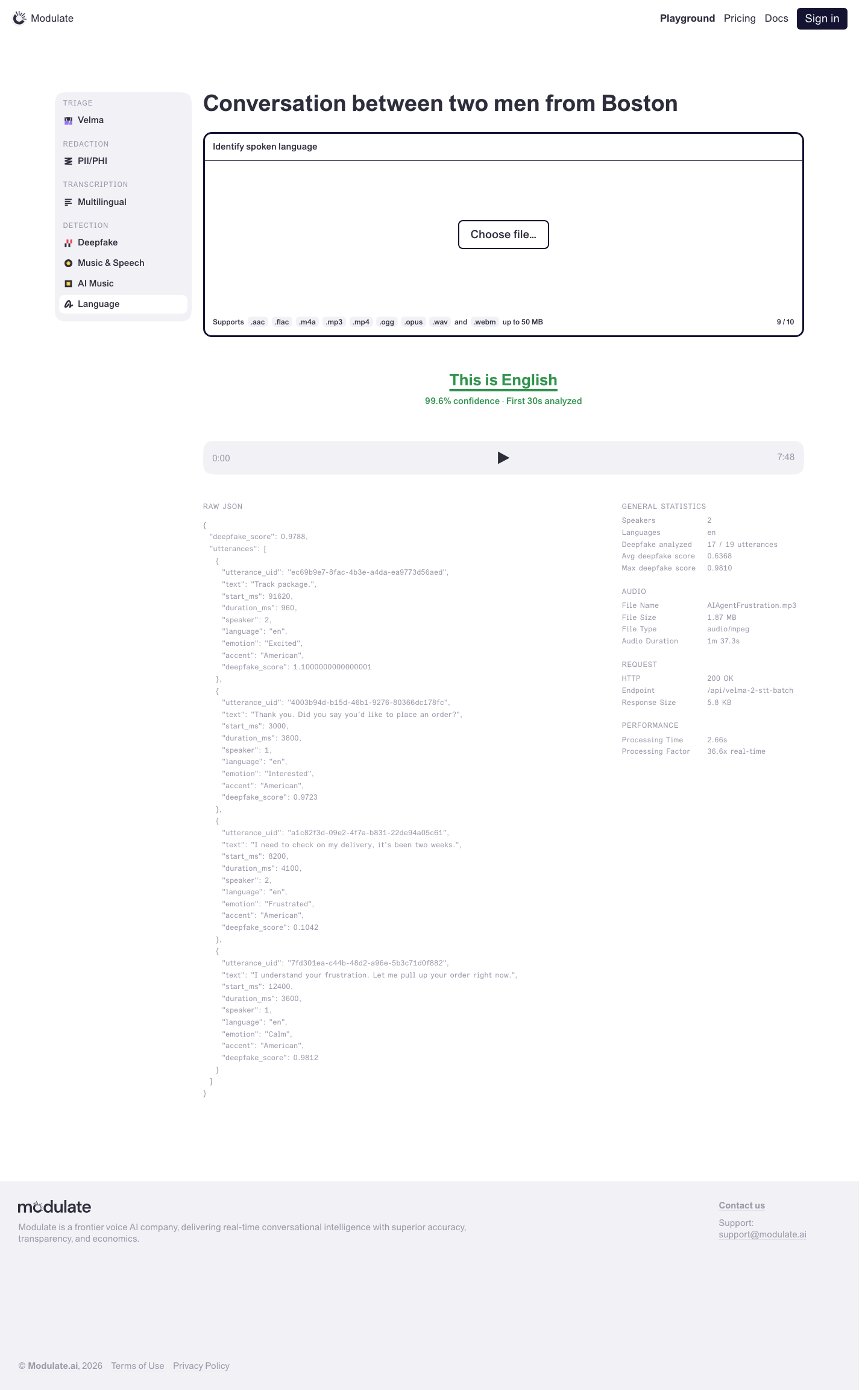
Playground — Language Detection
Prototype: Playground — Language Detection, default

Prototype changed. Capture again to compare.
—

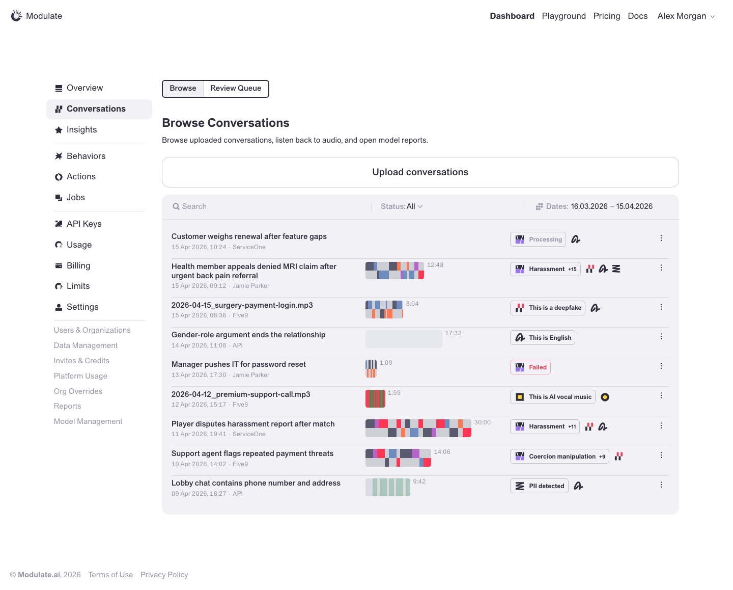
Browse Conversations
Prototype: Browse Conversations, default

Prototype changed. Capture again to compare.
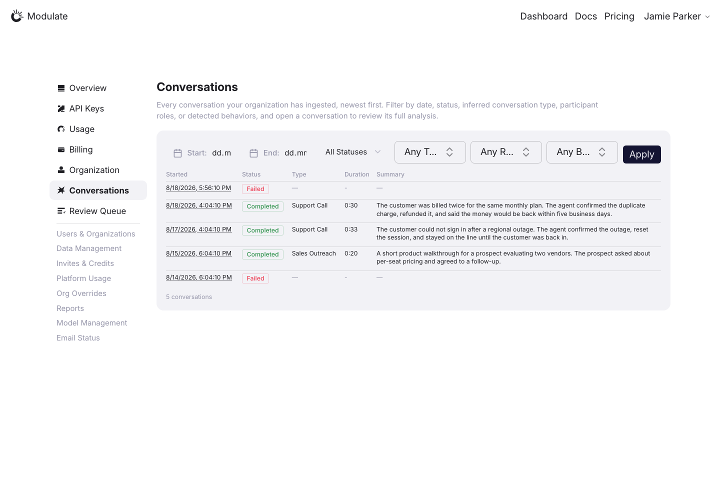
Production: Browse Conversations, default
  • Page navigation — Browse / Review Queue tabs are absent above the heading.
  • Page heading — The prototype uses “Browse Conversations”.
  • Filter bar — Production uses dates, Status / Type / Role / Behavior and Apply. The prototype uses Search, Status, a shared date range and Bulk actions. Several production field labels are clipped.
  • Conversation rows — Production shows a Started / Status / Type / Duration / Summary table. The prototype has titles, metadata, audio visualizations, model results and a row menu.
View data diff

Upload conversations is absent from the production capture; verify availability for the intended role. Conversation text and counts depend on data.

Captured 30 September 2026 with field replacement before rendering; names, emails, organizations, IDs and account values use synthetic values.

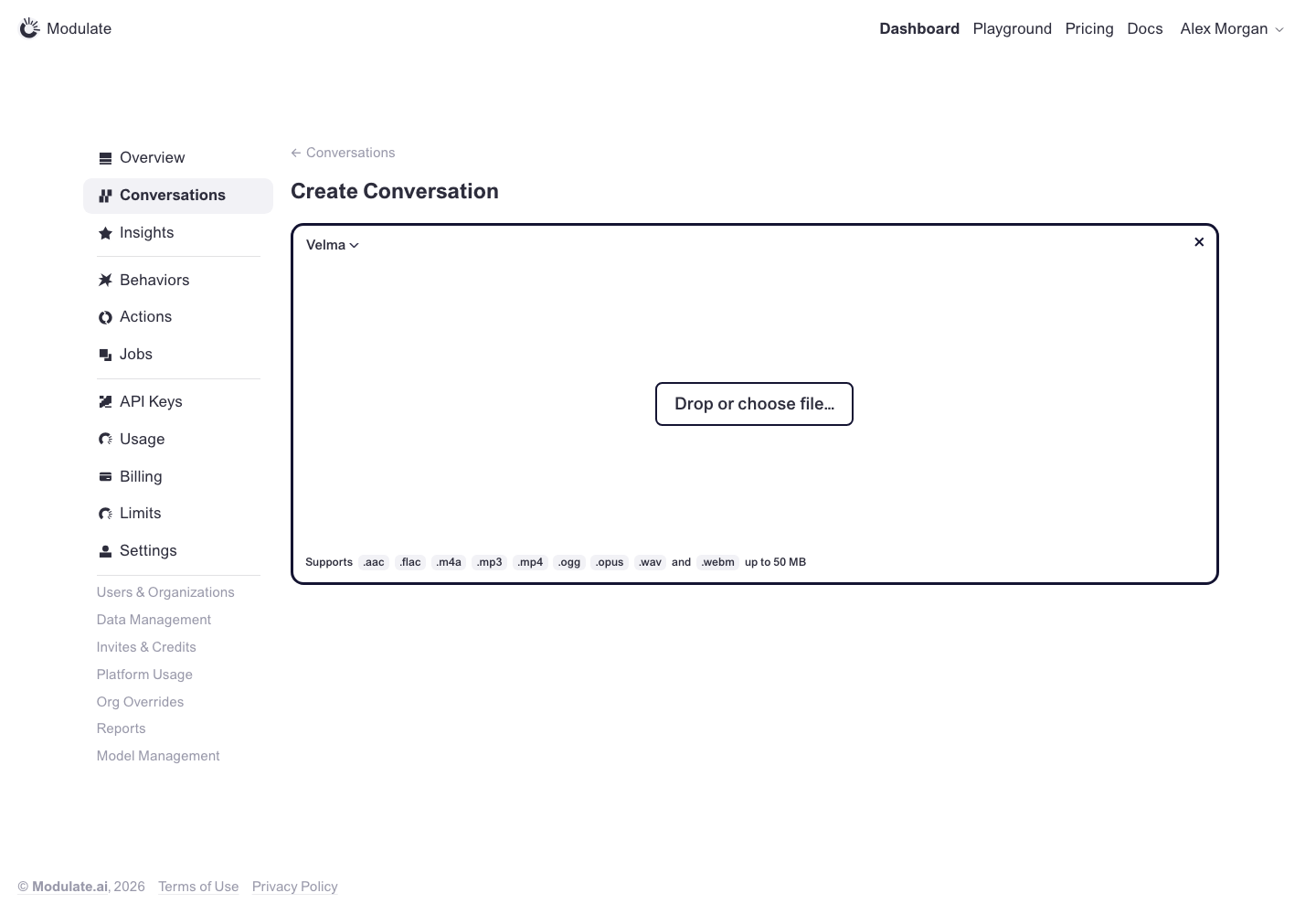
Create Conversation
Prototype: Create Conversation, default

Prototype changed. Capture again to compare.
—

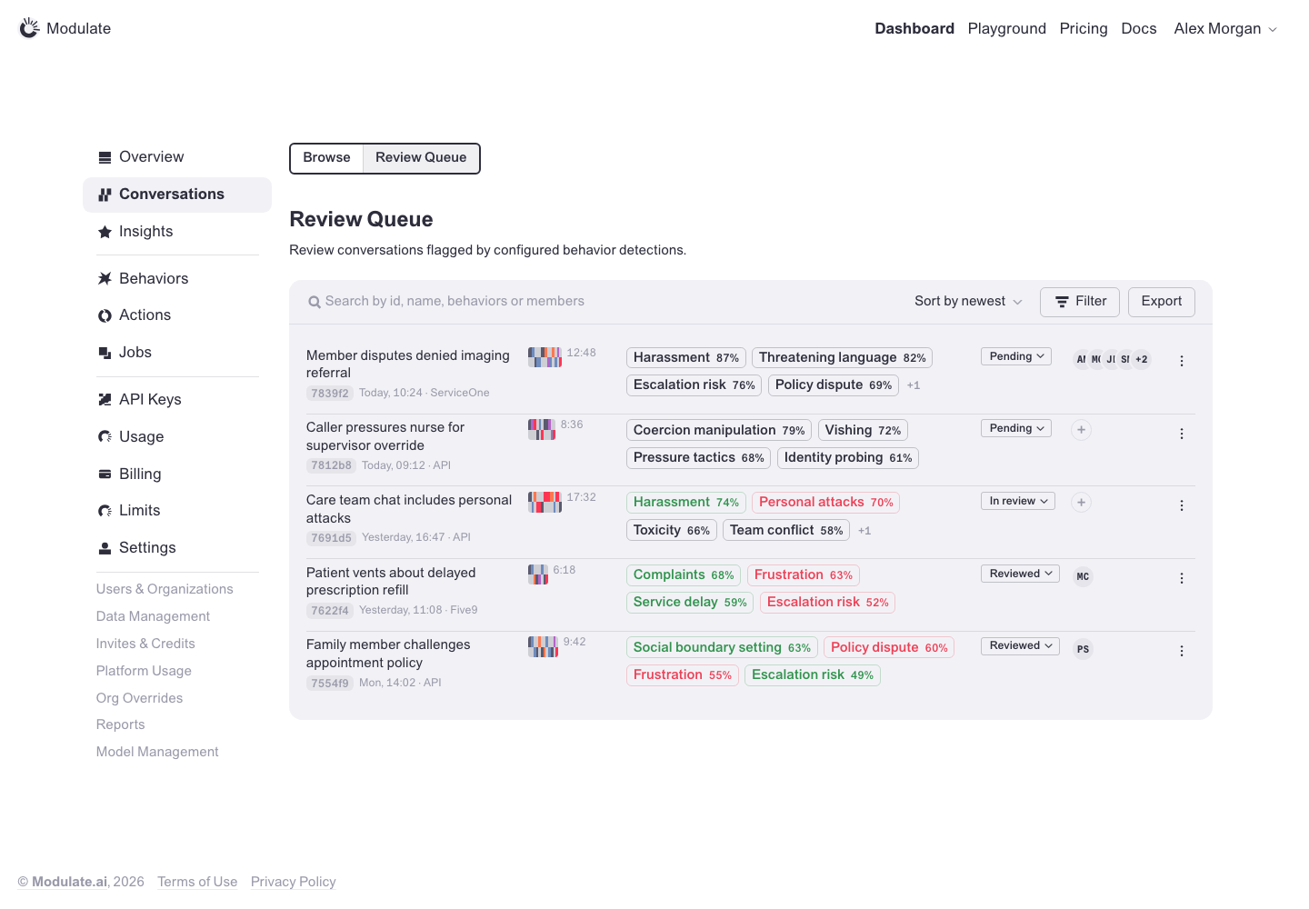
Review Queue
Prototype: Review Queue, default

Prototype changed. Capture again to compare.
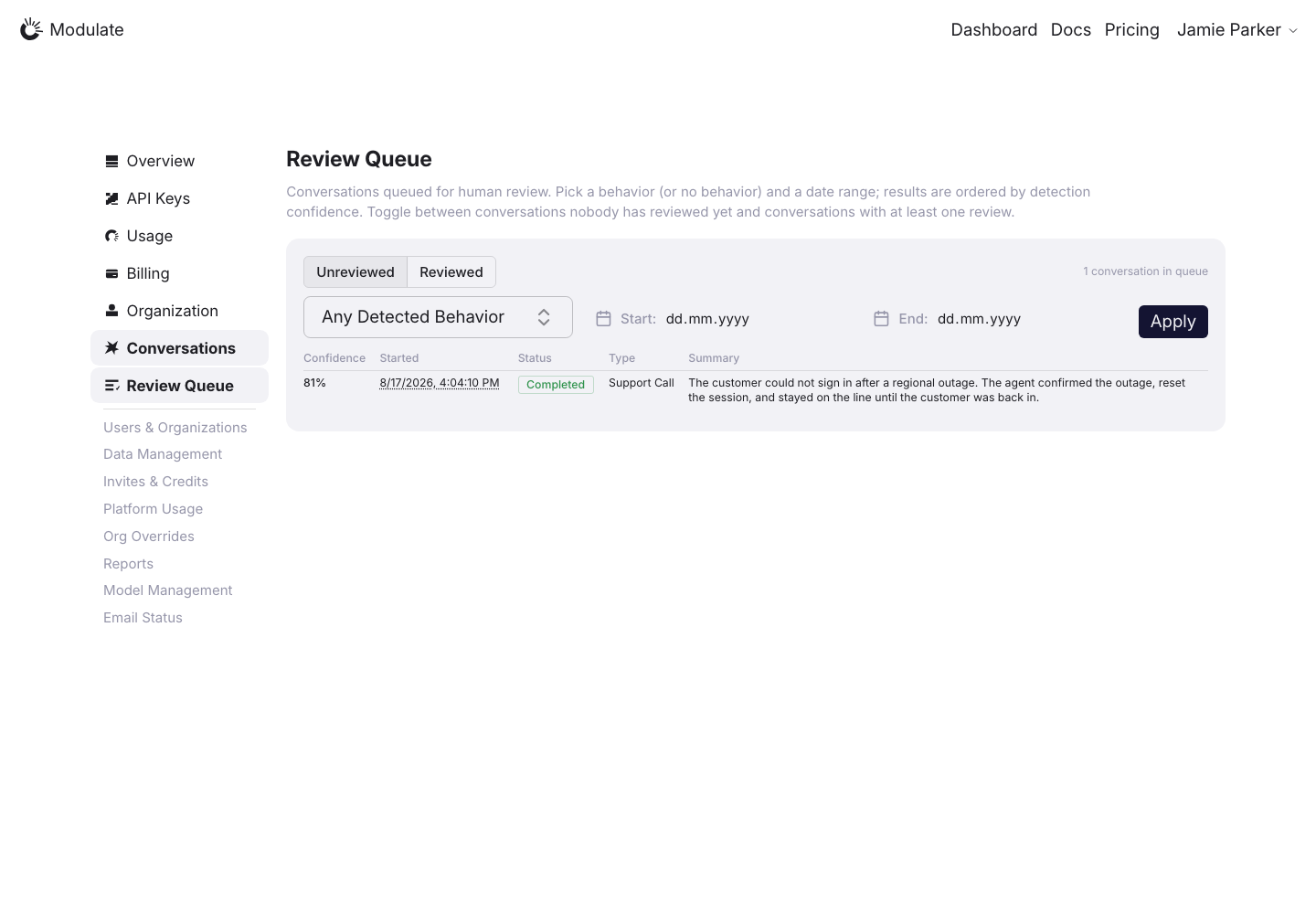
Production: Review Queue, default
  • Page navigation — Browse / Review Queue tabs are absent. The sidebar marks Conversations and Review Queue active at the same time.
  • Filter bar — Production uses Unreviewed / Reviewed, one behavior filter, two dates and Apply. The prototype has a search line with Sort, Filter and Export.
  • Review rows — Production shows a Confidence / Started / Status / Type / Summary table. The prototype has titles, metadata, audio visualizations, multiple behavior badges with scores, a status select, reviewer avatars or an add button, and an actions menu.
View data diff

Production uses /dashboard/conversations/review-queue. Compare this mapped route with the prototype review queue.

Captured 30 September 2026 with field replacement before rendering; names, emails, organizations, IDs and account values use synthetic values.

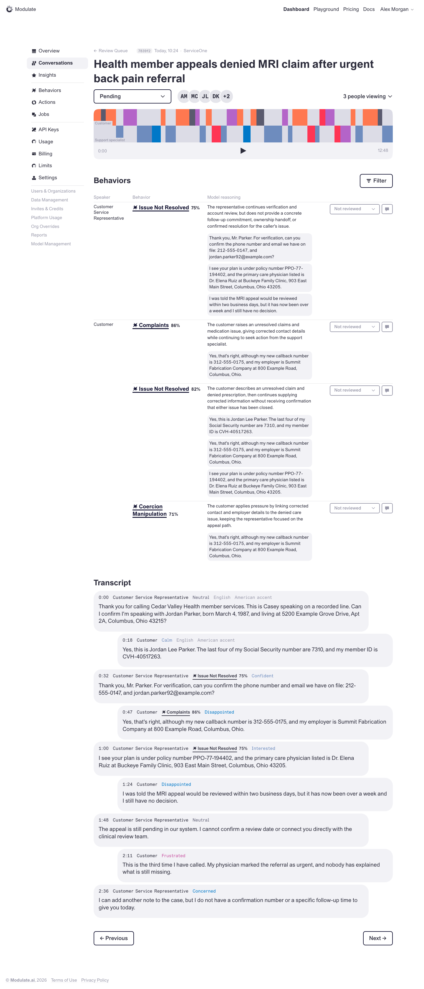
Conversation Review
Prototype: Conversation Review, default

Prototype changed. Capture again to compare.
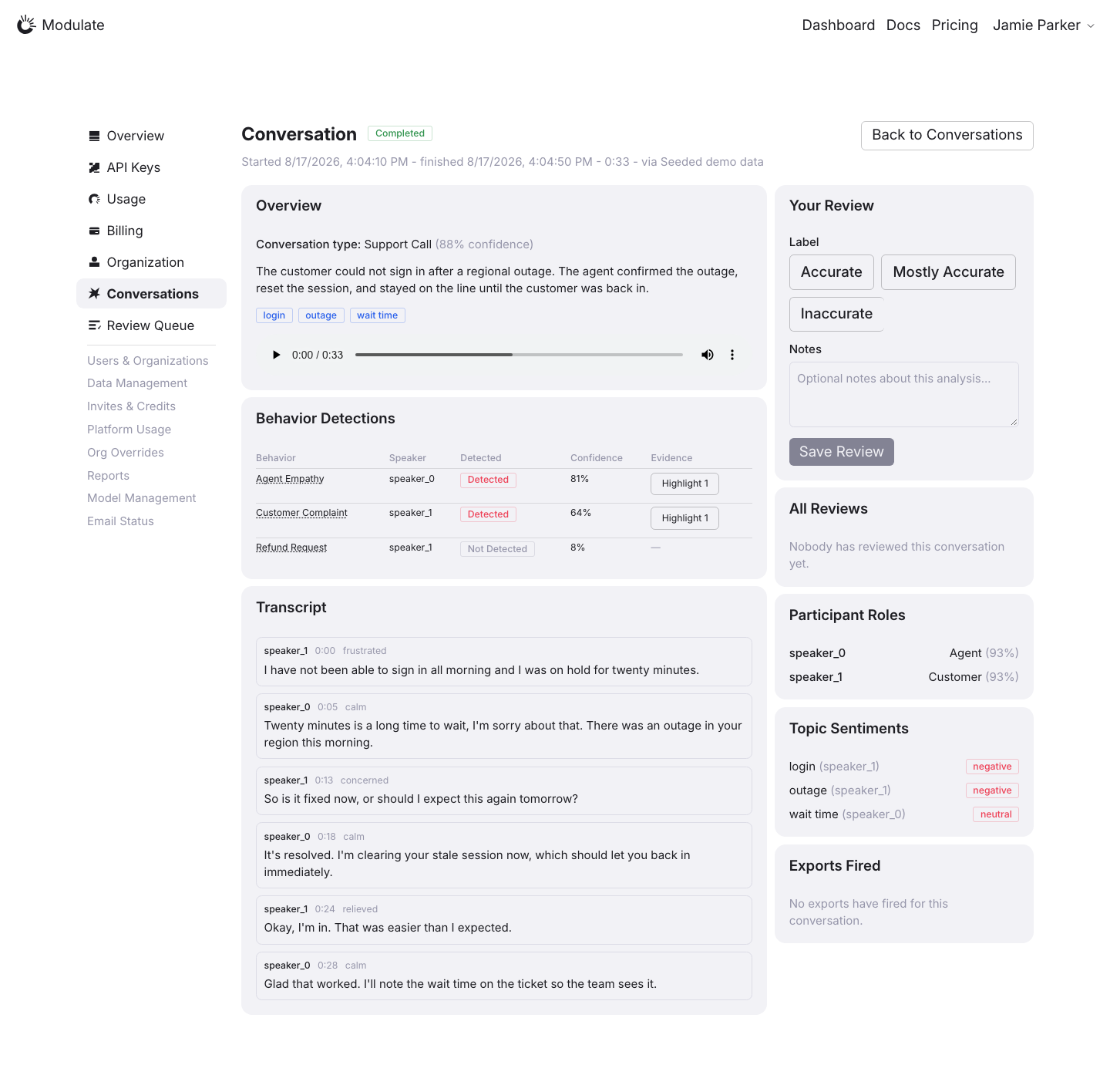
Production: Conversation Review, default
  • Heading and review status — Production shows “Conversation” and a Completed processing badge. The prototype has a descriptive title, a Pending / In review / Reviewed select, reviewer avatars and a people-viewing indicator.
  • Behavior review — Production has a Behavior / Speaker / Detected / Confidence / Evidence table with Highlight buttons, and a separate conversation-level Accurate / Mostly Accurate / Inaccurate form. The prototype shows reasoning and evidence excerpts inline, with a verdict select (Not reviewed) and a comment button for each detection.
  • Behavior filters — The prototype’s Filter button above the Behaviors table is absent from this production page.
  • Transcript — Production shows outlined rows with speaker IDs, start times and emotion labels. The prototype uses speech bubbles with descriptive speaker labels, language/accent metadata and behavior badges with confidence.
  • Queue navigation — Production links back to Conversations. The prototype links back to Review Queue and has Previous / Next controls below the transcript; these controls are absent from the production capture.
  • Section layout — Production adds Overview, Your Review, All Reviews, Participant Roles, Topic Sentiments and Exports Fired cards around the behavior table and transcript. The prototype focuses on the player, behavior review and transcript in one main column.
View data diff

Production uses the same conversation page for the report and Review Queue detail. Both Compare rows reuse the same saved production image.

Production and prototype contain different conversations. Text, duration, detection counts and confidence values are data differences. Completed describes processing, while Pending / In review / Reviewed describes the prototype review workflow.

Captured 30 September 2026 with field replacement before rendering; names, emails, organizations, IDs and account values use synthetic values.

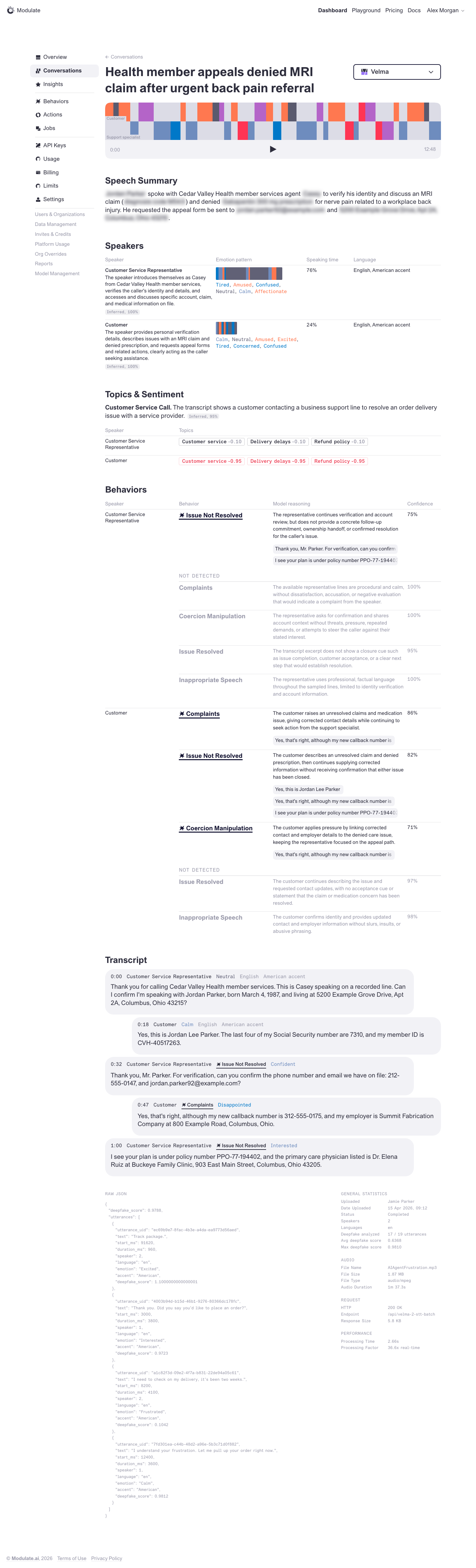
Conversation Report
Prototype: Conversation Report, default

Prototype changed. Capture again to compare.
Production: Conversation Report, default
  • Page heading — Production shows “Conversation”, a Completed badge and timestamps. The prototype uses a descriptive conversation title and a model selector.
  • Section layout — Production puts Overview, Behavior Detections and Transcript in cards in the main column, with review and analysis cards in a right column. The prototype presents its analysis sections in one wide column.
  • Audio player and summary — Production places a native audio player below the summary and topic tags inside Overview. The prototype starts with a custom timeline player and shows Speech Summary as a separate section below it.
  • Behavior Detections — Production uses a table with Behavior, Speaker, Detected, Confidence and Evidence columns, plus Highlight buttons. The prototype groups behaviors by speaker and shows reasoning and confidence inline.
  • Participants — Production’s Participant Roles card lists speaker IDs, roles and confidence. The prototype’s Speakers table also includes emotion pattern, speaking time and language.
  • Topics and sentiment — Production lists topics, speaker IDs and sentiment badges in the right column. The prototype places Topics & Sentiment in the main analysis flow.
  • Transcript — Production uses outlined rows with a speaker ID, start time and emotion. The prototype uses speech bubbles with speaker labels and behavior badges.
  • Additional sections — Production includes Your Review, All Reviews and Exports Fired cards. The prototype report instead includes Raw JSON and Statistics sections, which are not visible on this production page.
View data diff

The production capture is the seeded support call supplied for this review. The prototype uses a different conversation fixture; utterances, duration, scores and the number of results are data differences.

The production page combines analysis and review controls. Confirm the intended scope of Conversation Report versus Conversation Review before treating the extra review cards as defects.

Captured 30 September 2026 with field replacement before rendering; names, emails, organizations, IDs and account values use synthetic values.

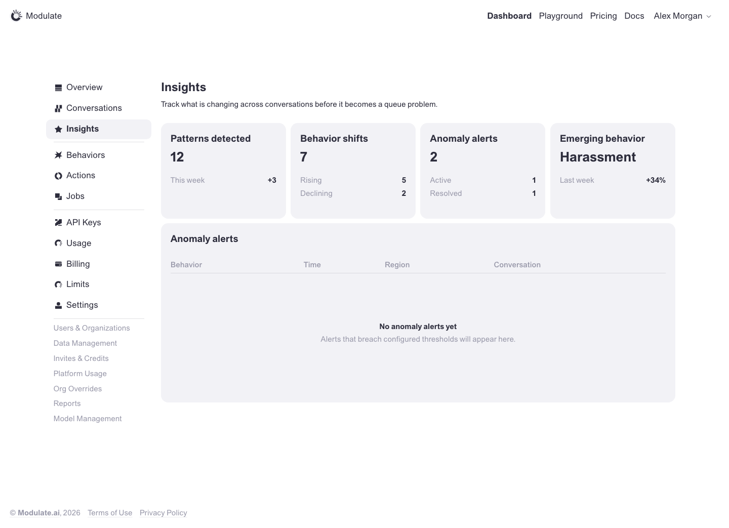
Insights
Prototype: Insights, default

Prototype changed. Capture again to compare.
—

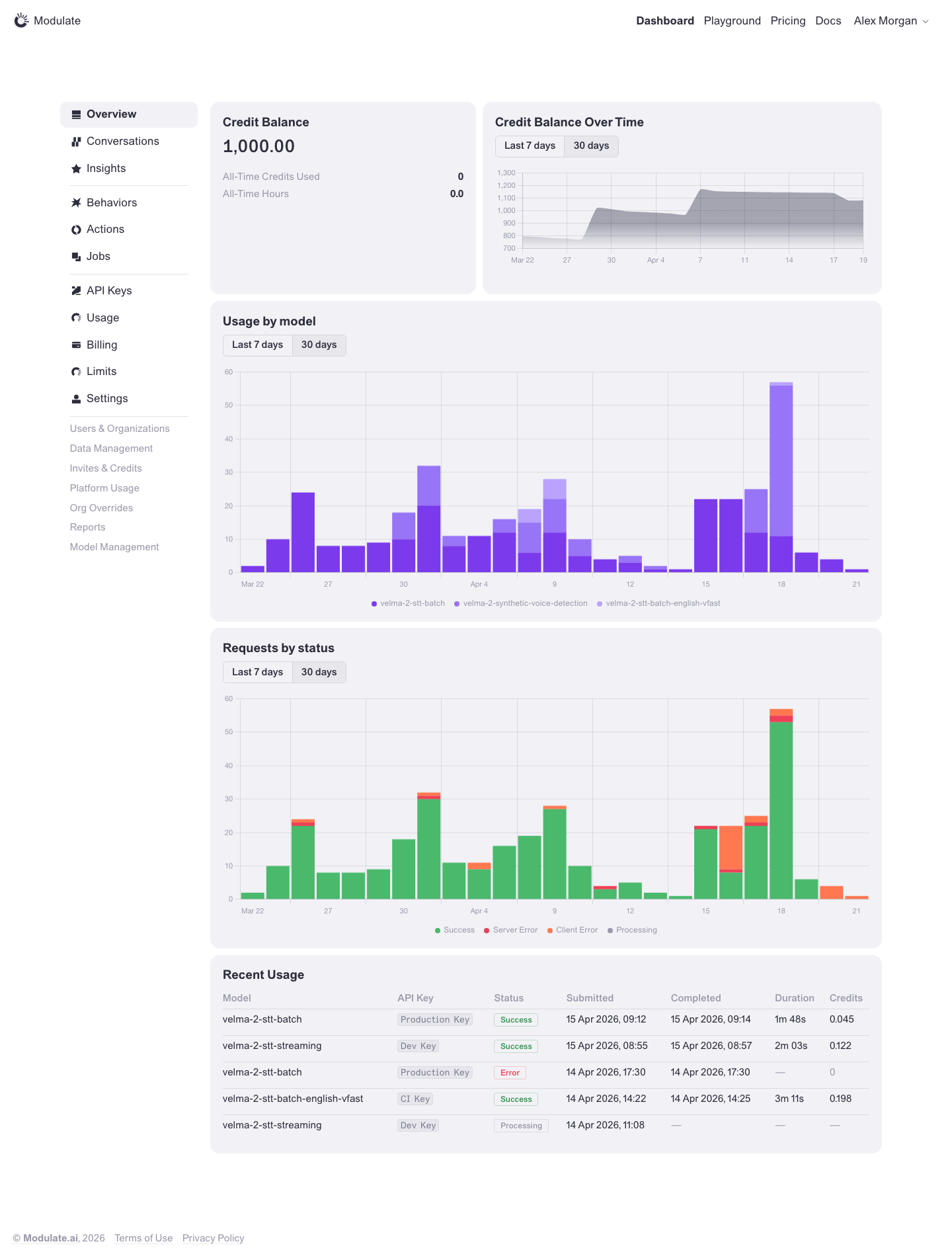
Overview
Prototype: Overview, default

Prototype changed. Capture again to compare.
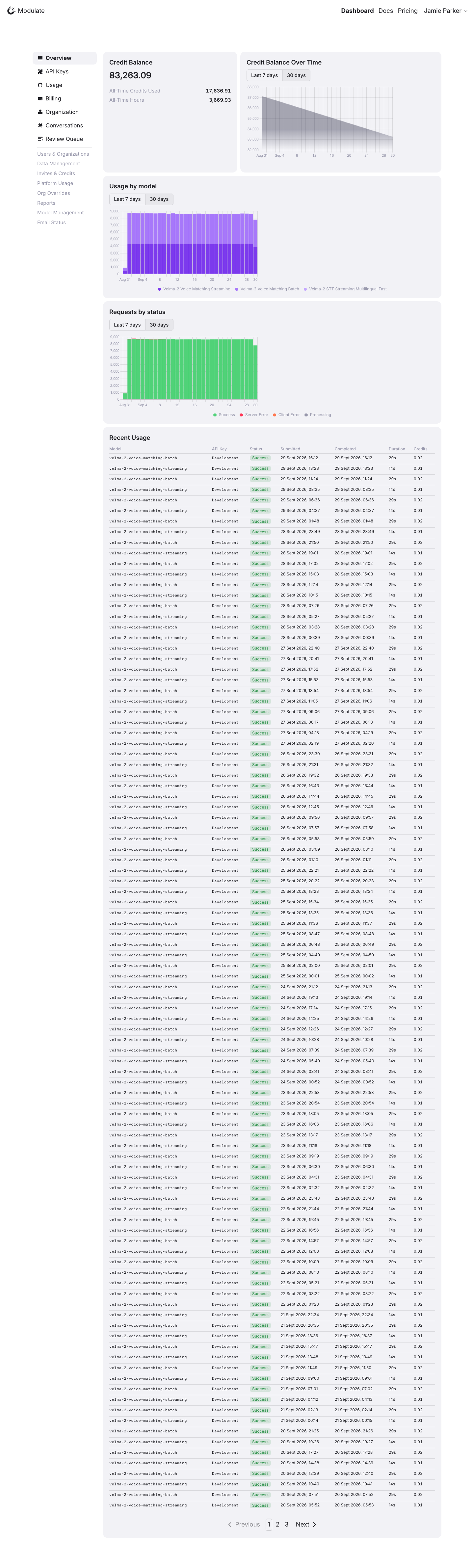
Production: Overview, default
  • Sidebar and header — Navigation order and grouping differ. The captured header has no Playground and uses a different Docs / Pricing order.
  • Card icons and spacing — Icons and spacing differ from the prototype cards.
  • Footer — The shared prototype footer is absent from the production capture.
View data diff

Insights, Behaviors, Actions, Jobs and Limits are absent from the captured sidebar; availability depends on role.

The main sections match: balance, three charts and Recent Usage. Values, periods, models, row counts and pagination vary with live data.

Captured 1 October 2026 with field replacement before rendering; names, emails, API key names and timestamps use synthetic values. Credit balances and amounts are shown unchanged.

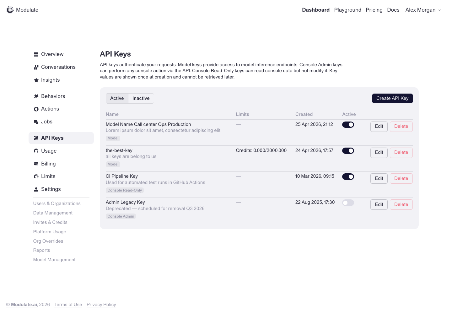
API Keys
Prototype: API Keys, default

Prototype changed. Capture again to compare.
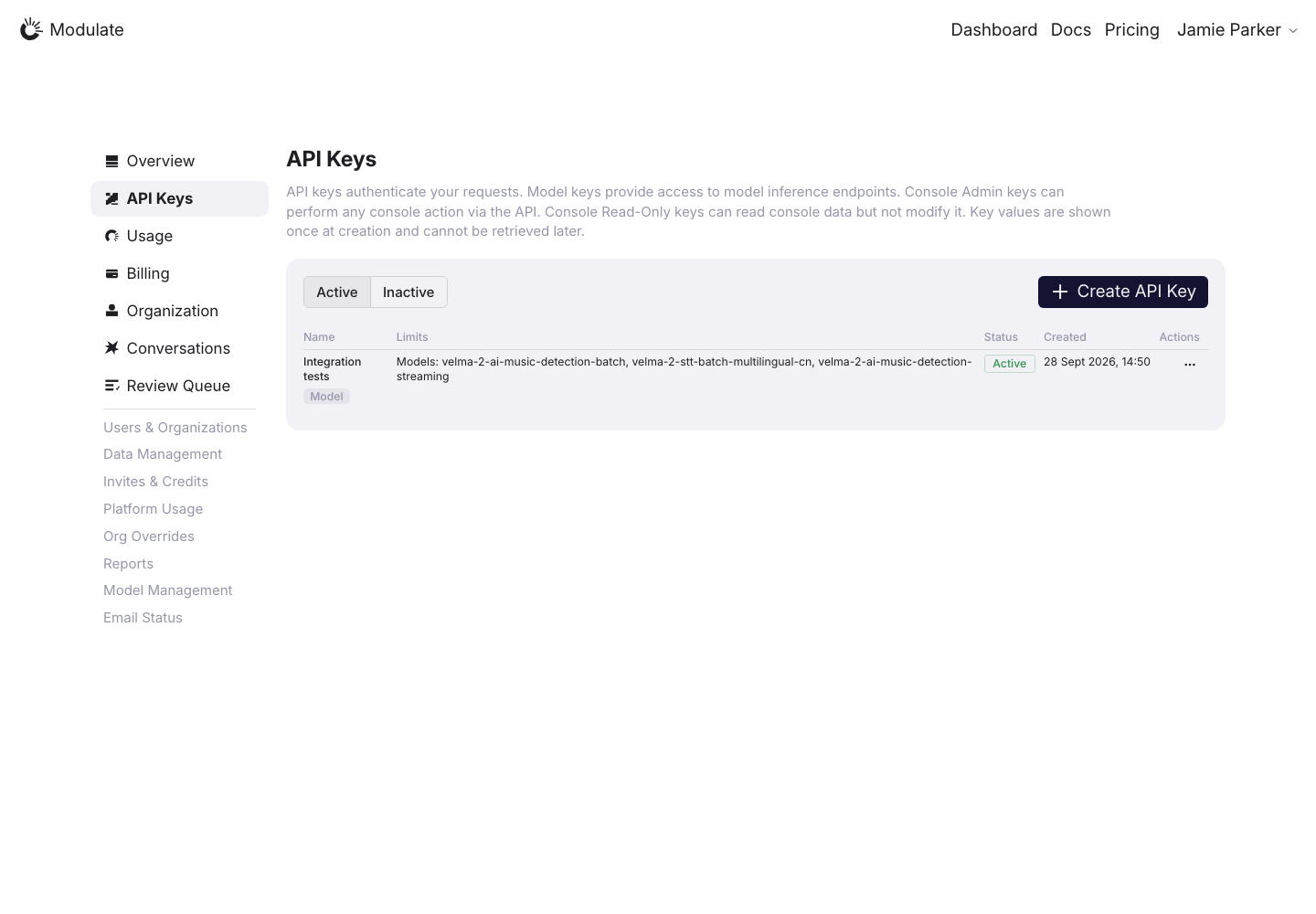
Production: API Keys, default
  • Create API Key button — The production Create API Key button is larger than the prototype and includes an unnecessary leading plus icon. Match the prototype button size, text size and padding, and remove the icon.
  • Panel and tabs — Panel spacing and the Active / Inactive tabs differ from the prototype.
  • Introductory text — The text is noticeably lighter in production.
  • Key rows — Production shows a Status badge and a row menu. The prototype shows an Active toggle and Edit / Delete buttons on each row.
View data diff

Production shows one key and the prototype shows four; key names, limits and dates are data differences.

Captured 30 September 2026 with field replacement before rendering; names, emails, organizations, IDs and account values use synthetic values.

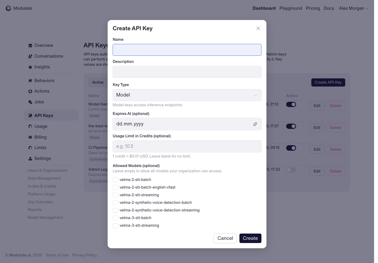
API Keys: Create key
Prototype: API Keys: Create key, default

Prototype changed. Capture again to compare.
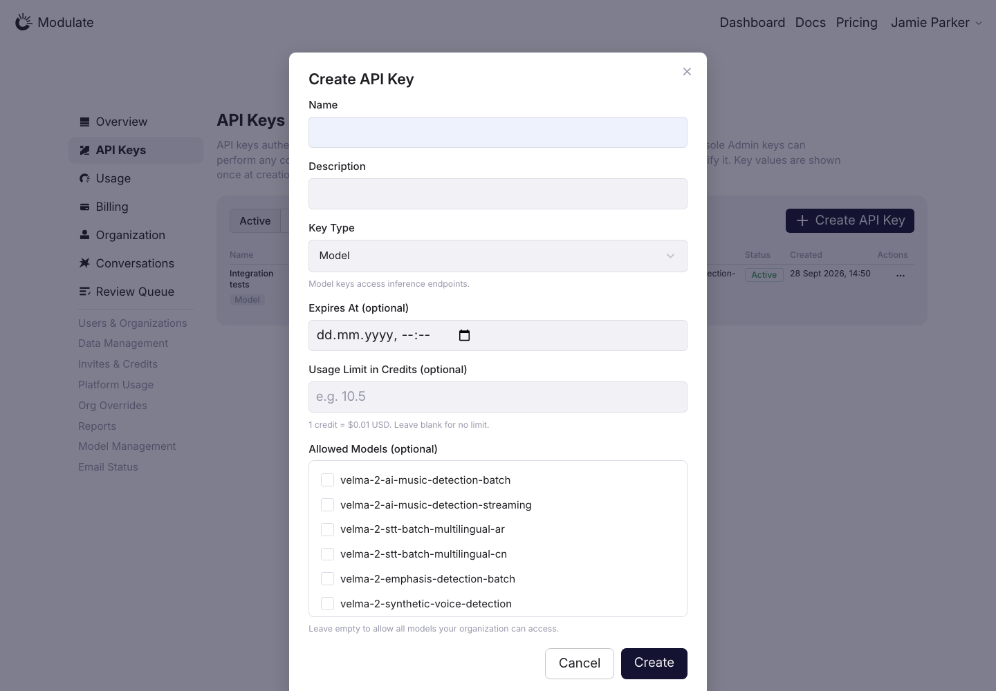
Production: API Keys: Create key, default
  • Modal container — The production modal is 574 px wide with 28.32 px padding and reaches close to the bottom edge; the prototype modal is 604 px wide.
  • Close button — Production has a 2.832 px radius and no padding; the prototype has a 5.664 px radius and 7.552 px padding.
  • Cancel / Create buttons — Production has a 7.552 px radius and 9.44 × 18.88 px padding. The prototype uses a 5.664 px radius and 5.664 × 13.216 px padding.
  • Allowed Models list — Production adds an outer border and a separate scroll area, with the label below the list. The prototype uses a compact list with the label above it.
  • Model labels — Shared labels use 18.88 px text in production instead of 15.104 px, and add rounded padding absent from the prototype.
  • Expires At field — Production includes both date and time; the prototype includes only a date.
View data diff

Confirm the intended date/time functionality and model catalog before changing the controls. Pixel measurements are from the saved 1440 px viewport.

Captured 30 September 2026 with field replacement before rendering; names, emails, organizations, IDs and account values use synthetic values.

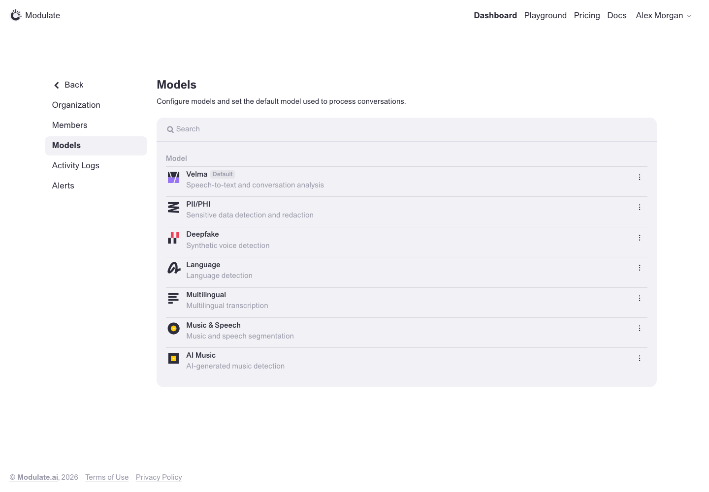
Models
Prototype: Models, default

Prototype changed. Capture again to compare.

—

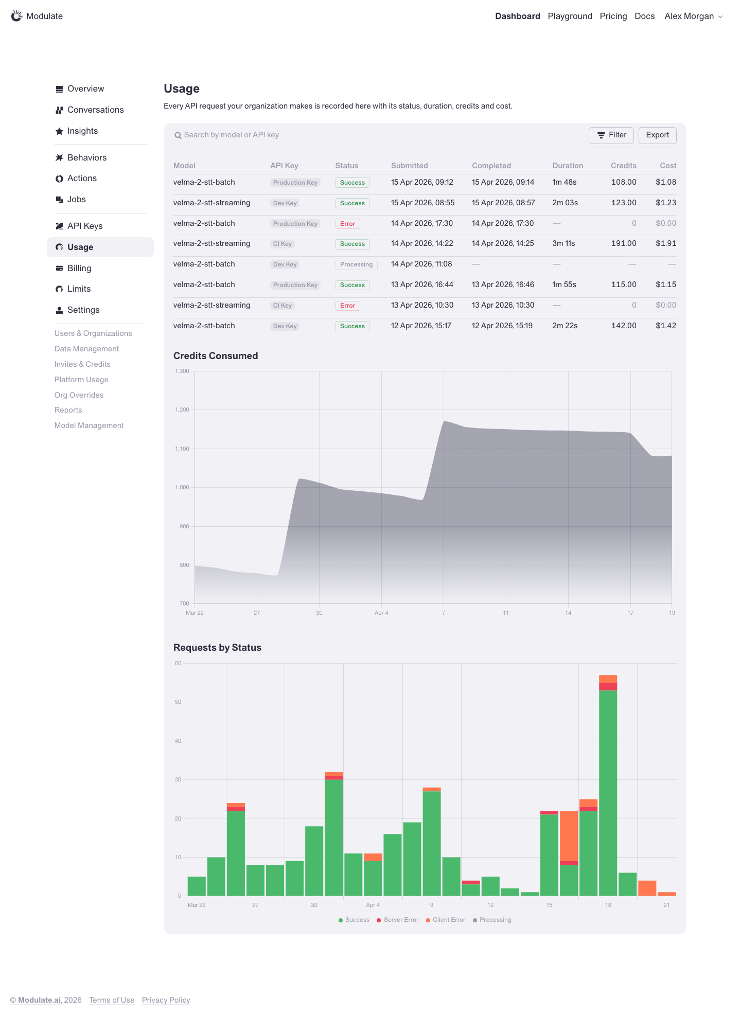
Usage
Prototype: Usage, default

Prototype changed. Capture again to compare.

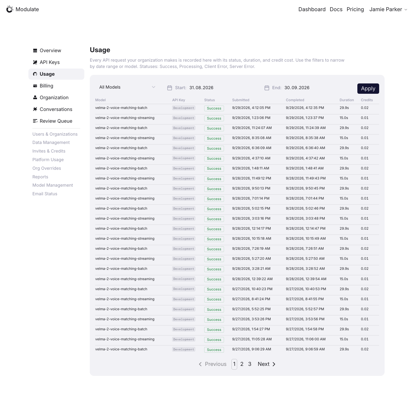
Production: Usage, default
  • Table header and filters — Production uses an All Models select, Start and End date pickers and an Apply button; the prototype uses a search line (model or API key) with Filter and Export buttons in the widget header.
  • Usage charts — Credits Consumed and Requests by Status are absent below the production request log.
  • Request log columns — The prototype adds a Cost column. Production shows dates as 9/29/2026, 4:12:05 PM and durations as 29.9s; the prototype uses 15 Apr 2026, 09:12 and 1m 48s.
  • Pagination — Production paginates the request log; the prototype shows a single list.
View data diff

Request counts, selected periods, models and pagination depend on data.

Captured 1 October 2026 with field replacement before rendering; names, emails, API key names and timestamps use synthetic values. Credit balances and amounts are shown unchanged.

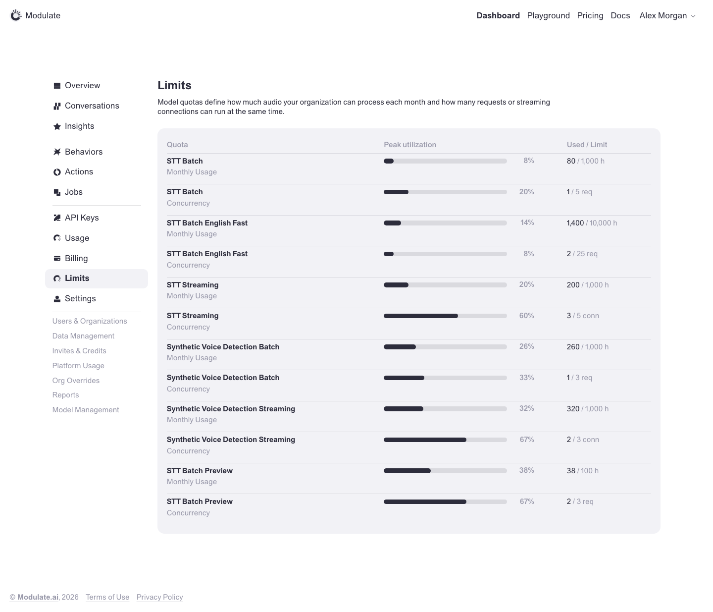
Limits
Prototype: Limits, default

Prototype changed. Capture again to compare.

—

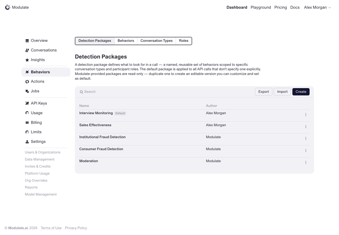
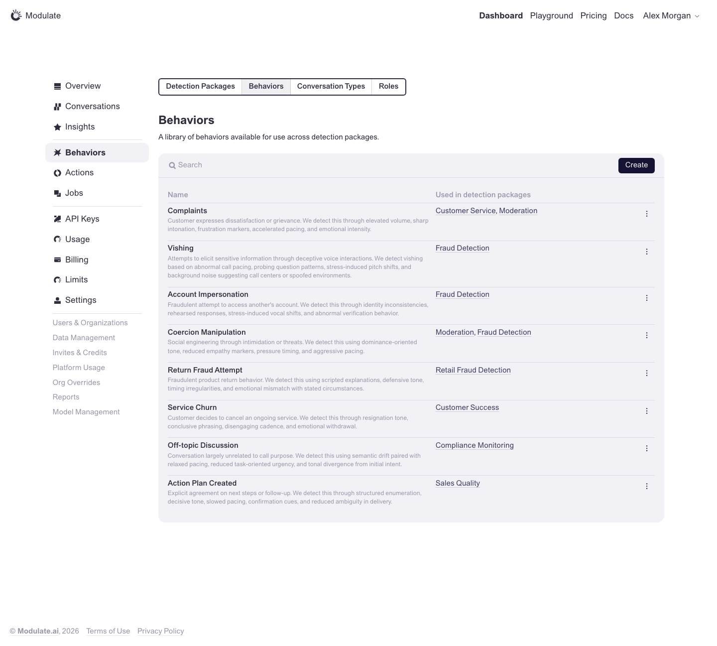
Behaviors: Detection Packages
Prototype: Behaviors: Detection Packages, default

Prototype changed. Capture again to compare.

—

Behaviors: Behaviors
Prototype: Behaviors: Behaviors, default

Prototype changed. Capture again to compare.

—

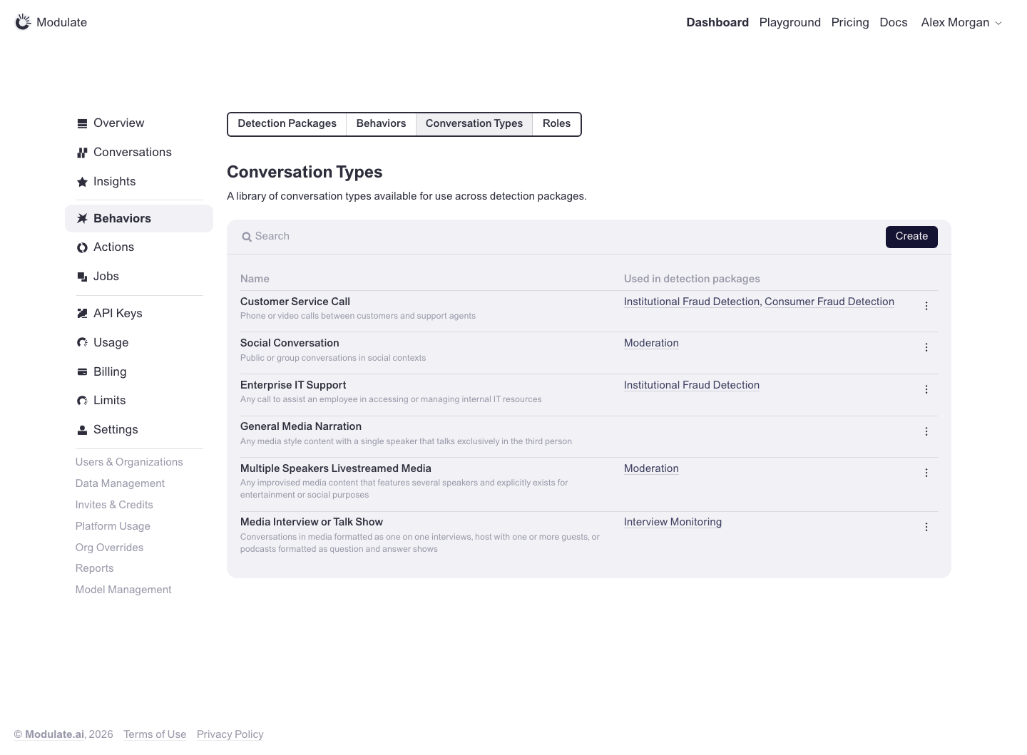
Behaviors: Conversation Types
Prototype: Behaviors: Conversation Types, default

Prototype changed. Capture again to compare.

—

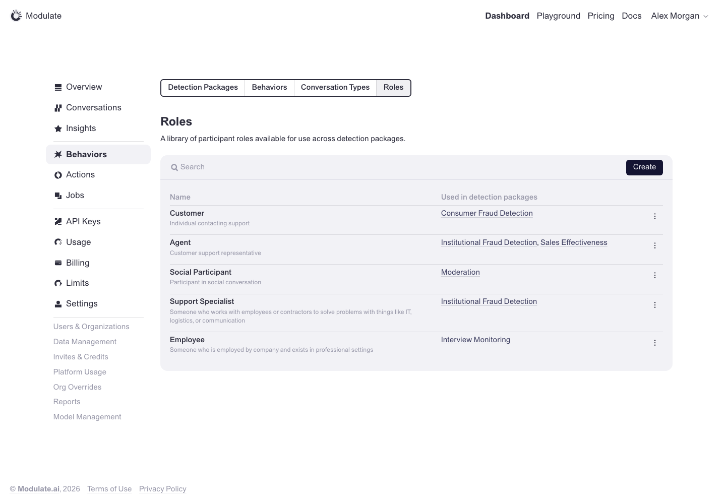
Behaviors: Roles
Prototype: Behaviors: Roles, default

Prototype changed. Capture again to compare.

—

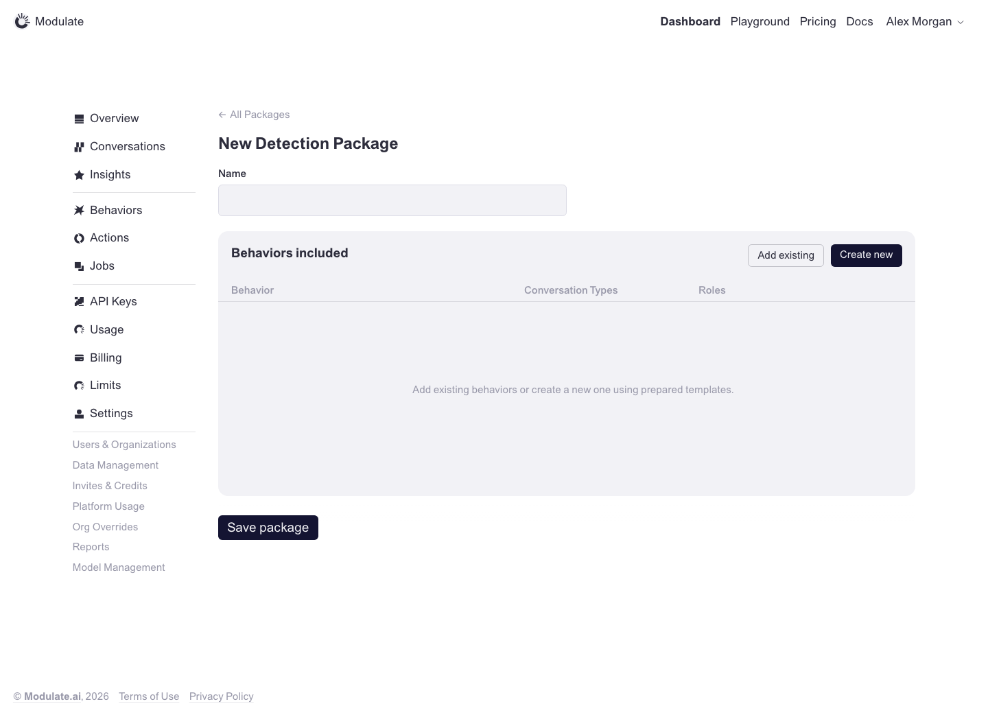
Detection Package: Create
Prototype: Detection Package: Create, default

Prototype changed. Capture again to compare.

—

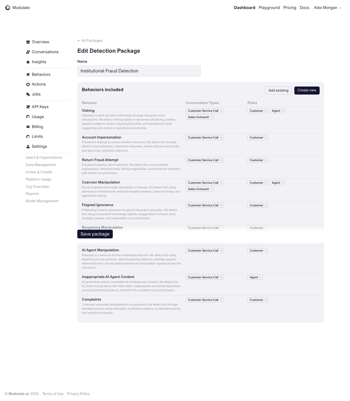
Detection Package: Edit
Prototype: Detection Package: Edit, default

Prototype changed. Capture again to compare.

—

Actions
Prototype: Actions, default

Prototype changed. Capture again to compare.

—

Jobs
Prototype: Jobs, default

Prototype changed. Capture again to compare.

—

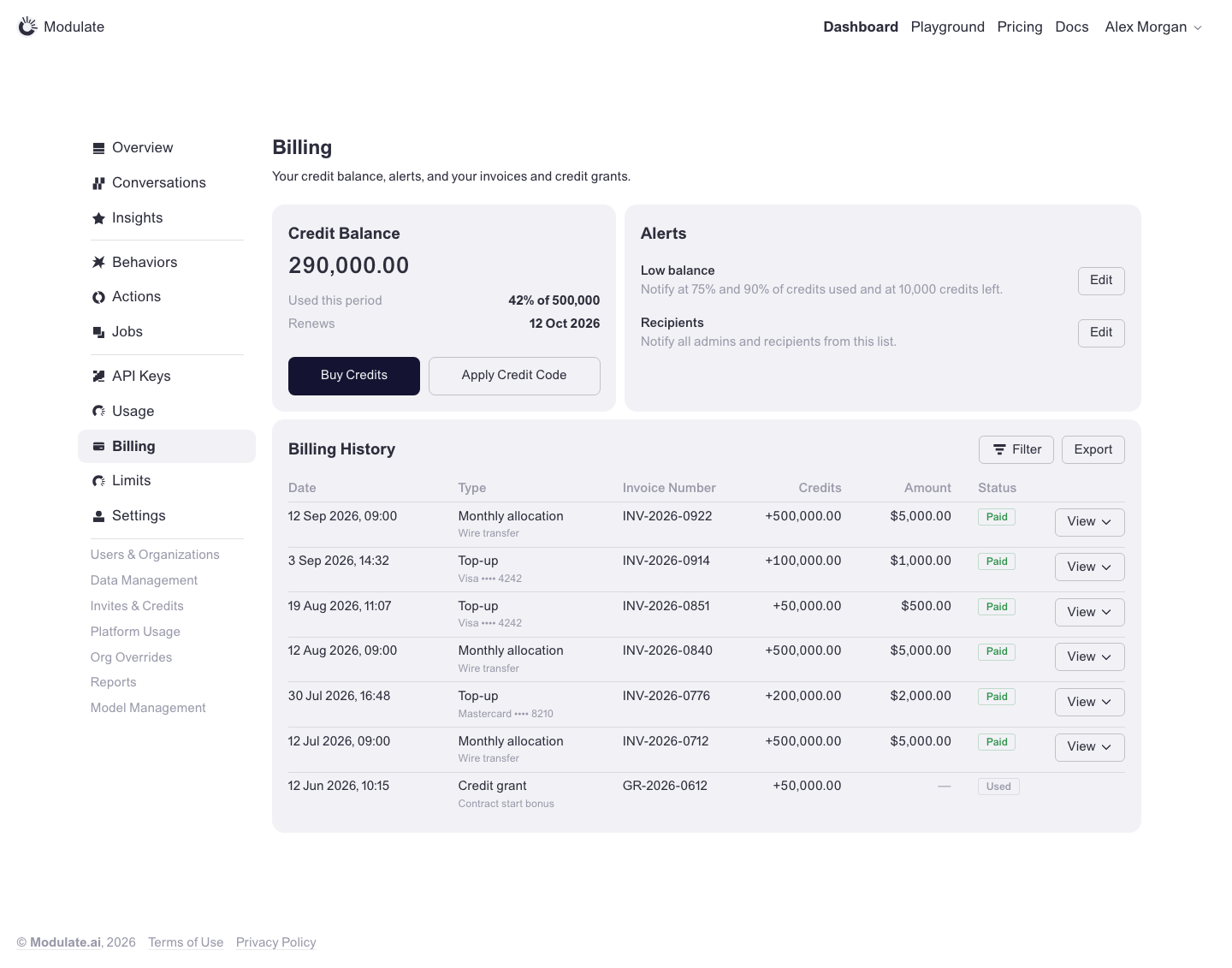
Billing: Overview
Prototype: Billing: Overview, default

Prototype changed. Capture again to compare.

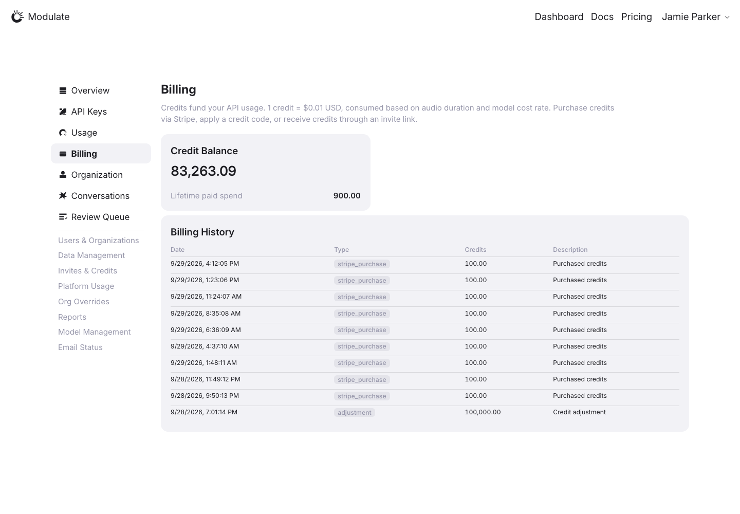
Production: Billing: Overview, default
  • Status row — Production shows Credit Balance alone; the prototype pairs Credit Balance with an Alerts card (Low balance, Recipients, each with Edit).
  • Credit Balance card — Production shows Lifetime paid spend; the prototype shows Used this period (share of the allocation) and the Renews date, with Buy Credits and Apply Credit Code buttons inside the card.
  • Billing History columns — Production: Date / Type / Credits / Description. Prototype: Date / Type / Invoice Number / Credits / Amount / Status, with a View menu on each row.
  • Billing History toolbar — The prototype has Filter (Date, Type, Status) and Export in the widget header; production has none.
  • Billing History values — Production shows raw type codes (stripe_purchase, adjustment) and dates as 9/24/2026, 9:20:10 PM; the prototype uses readable types with a payment-method line and dates as 12 Sep 2026, 09:00.
View data diff

Prototype default state: Contracting customer, admin role, no banner. Auto Top-Up (Pay/Go only) and the usage banners are other prototype states and are not compared here.

Purchase actions are absent from the production capture. Verify availability for the same role and organization type before requesting them. Transactions and balances reflect live data.

Captured 1 October 2026 with field replacement before rendering; names, emails, API key names and timestamps use synthetic values. Credit balances and amounts are shown unchanged.

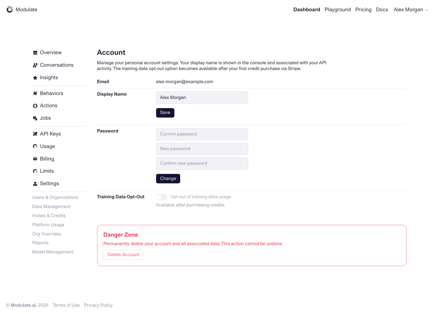
Account
Prototype: Account, default

Prototype changed. Capture again to compare.

Production: Account, default
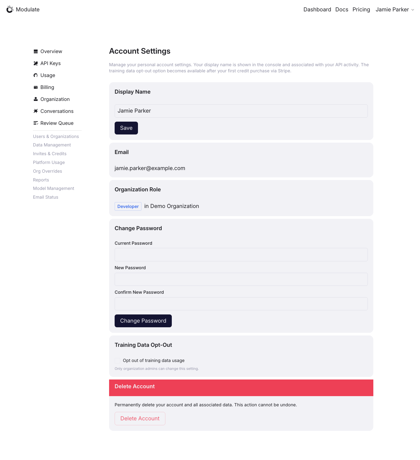
  • Settings layout — Production places each setting in a separate filled card. The prototype uses a compact two-column table for Email, Display Name, Password and Training Data Opt-Out.
  • Heading and field order — Production uses “Account Settings” and places Display Name before Email. The prototype uses “Account” and starts with Email.
  • Organization Role — Production adds an Organization Role card between Email and Change Password; this section is absent from the prototype.
  • Password fields — Production uses full-width fields with labels above them and a “Change Password” button. The prototype uses narrower fields with placeholder labels and a “Change” button.
  • Delete Account — Production uses a filled card with a solid red heading strip. The prototype uses an outlined red “Danger Zone” block.
  • Footer — The prototype has copyright and legal links below the settings; these are absent from the production capture.
View data diff

Production shows a Developer role and disables training opt-out with an admin-permission message. The prototype explains availability after purchasing credits. These are different access states.

Captured 30 September 2026 with field replacement before rendering; names, emails, organizations, IDs and account values use synthetic values.

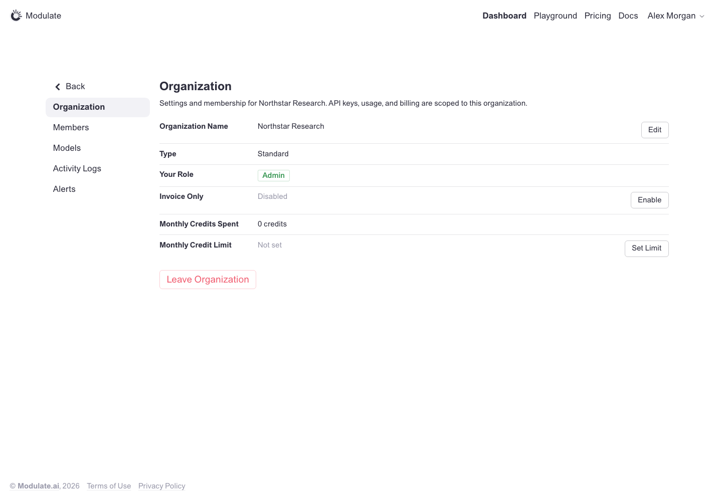
Organization
Prototype: Organization, default

Prototype changed. Capture again to compare.

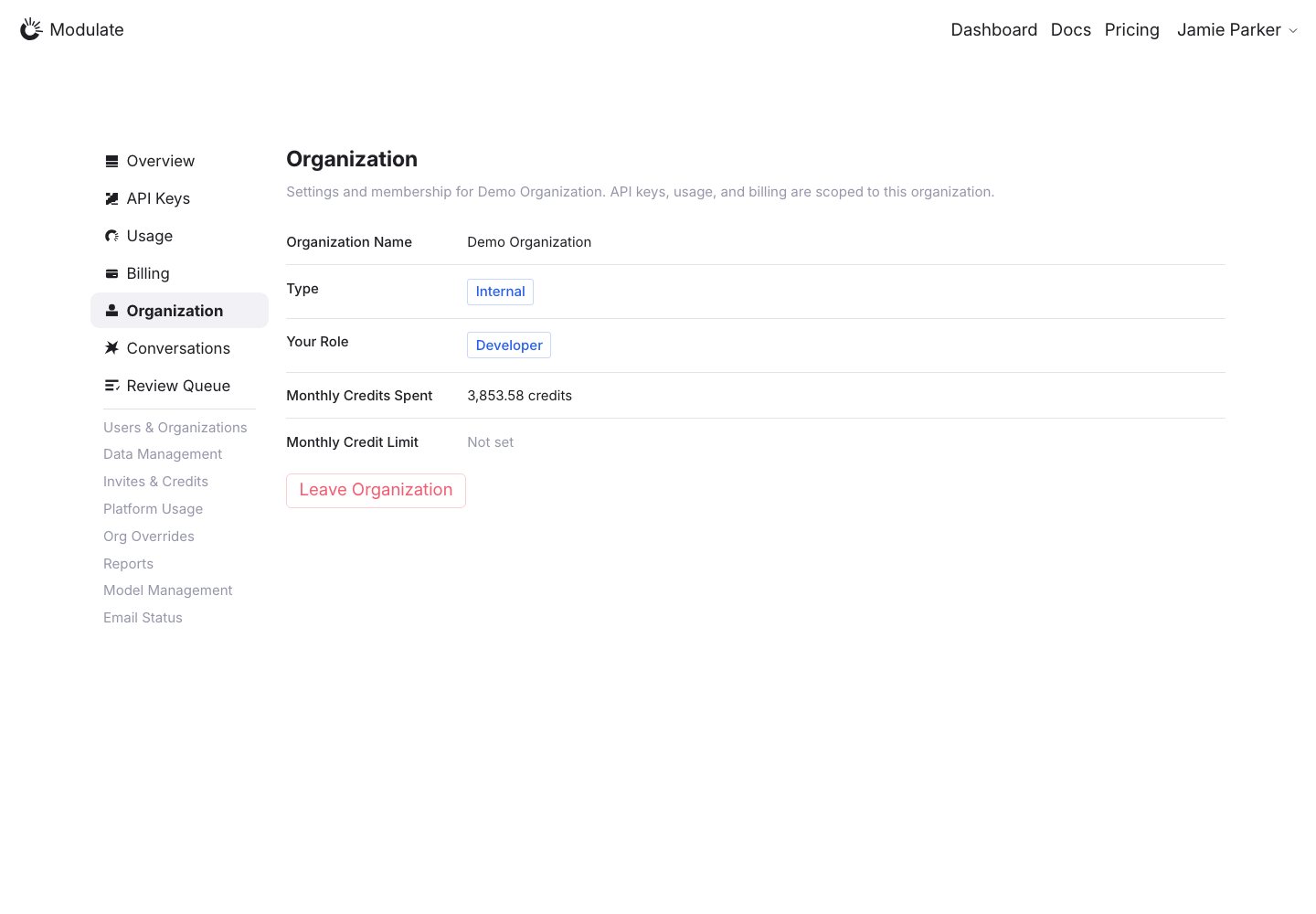
Production: Organization, default
  • Settings navigation — Production keeps the main dashboard menu. The prototype switches to Back / Organization / Members / Models / Activity Logs / Alerts.
  • Settings fields and badges — Label weights, vertical spacing and badges differ from the prototype.
View data diff

Invoice Only and Edit / Enable / Set Limit are absent from the capture. Production is Internal / Developer and the prototype is Standard / Admin; verify these controls with matching permissions and organization type.

Captured 1 October 2026 with field replacement before rendering; names, emails, API key names and timestamps use synthetic values. Credit balances and amounts are shown unchanged.

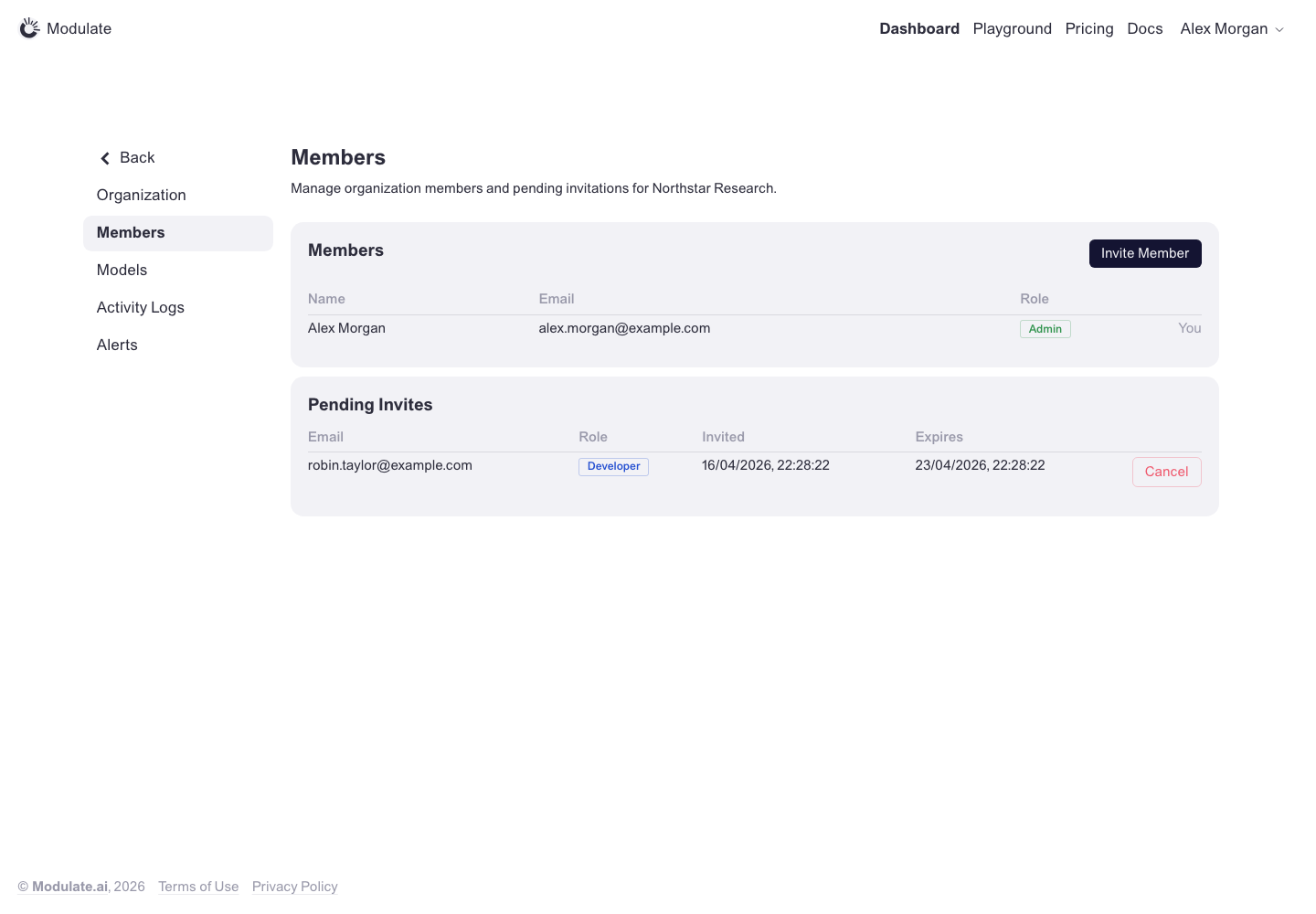
Members
Prototype: Members, default

Prototype changed. Capture again to compare.

—

Activity Logs
Prototype: Activity Logs, default

Prototype changed. Capture again to compare.

—

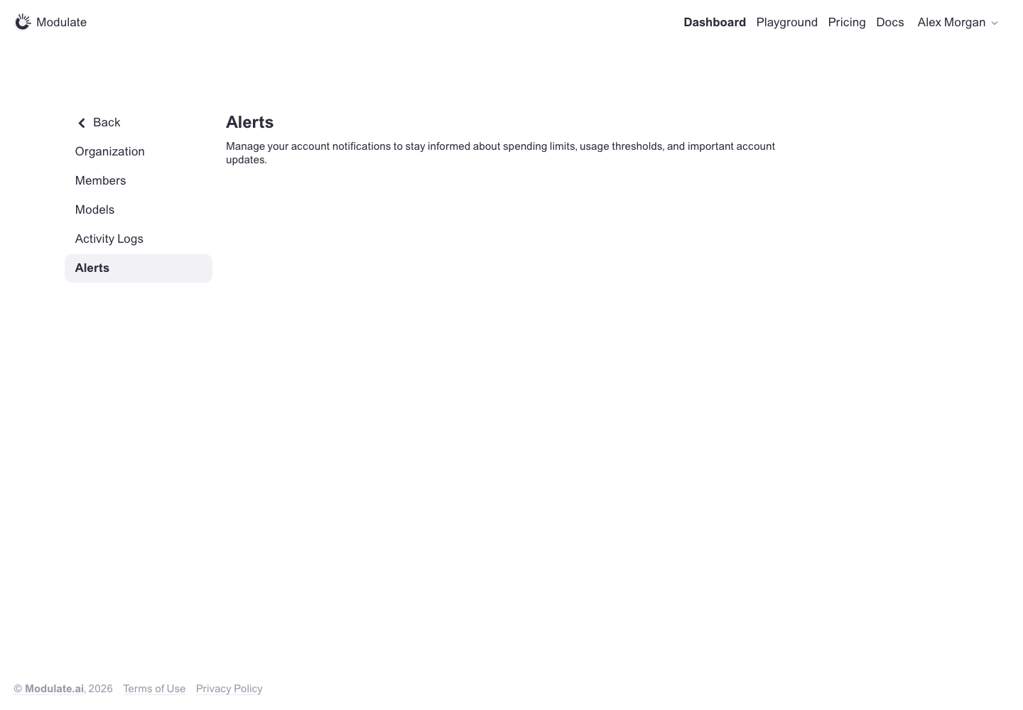
Alerts
Prototype: Alerts, default

Prototype changed. Capture again to compare.

—

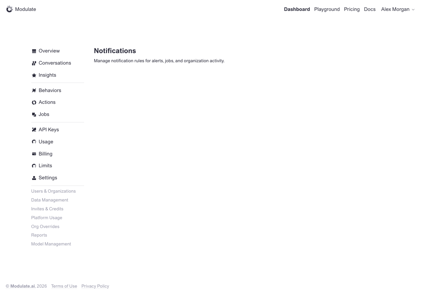
Notifications
Prototype: Notifications, default

Prototype changed. Capture again to compare.

—

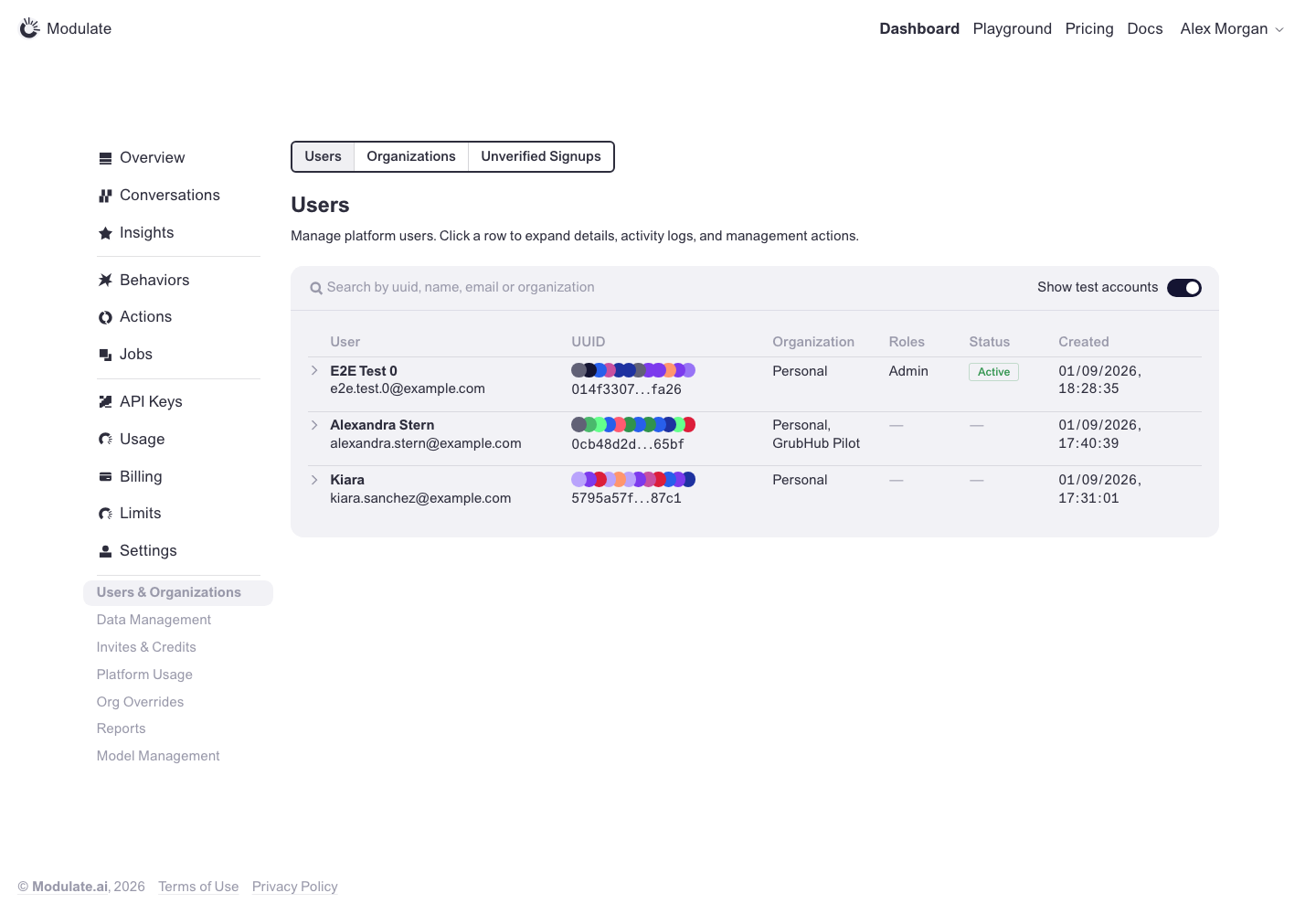
Internal: Users
Prototype: Internal: Users, default

Prototype changed. Capture again to compare.

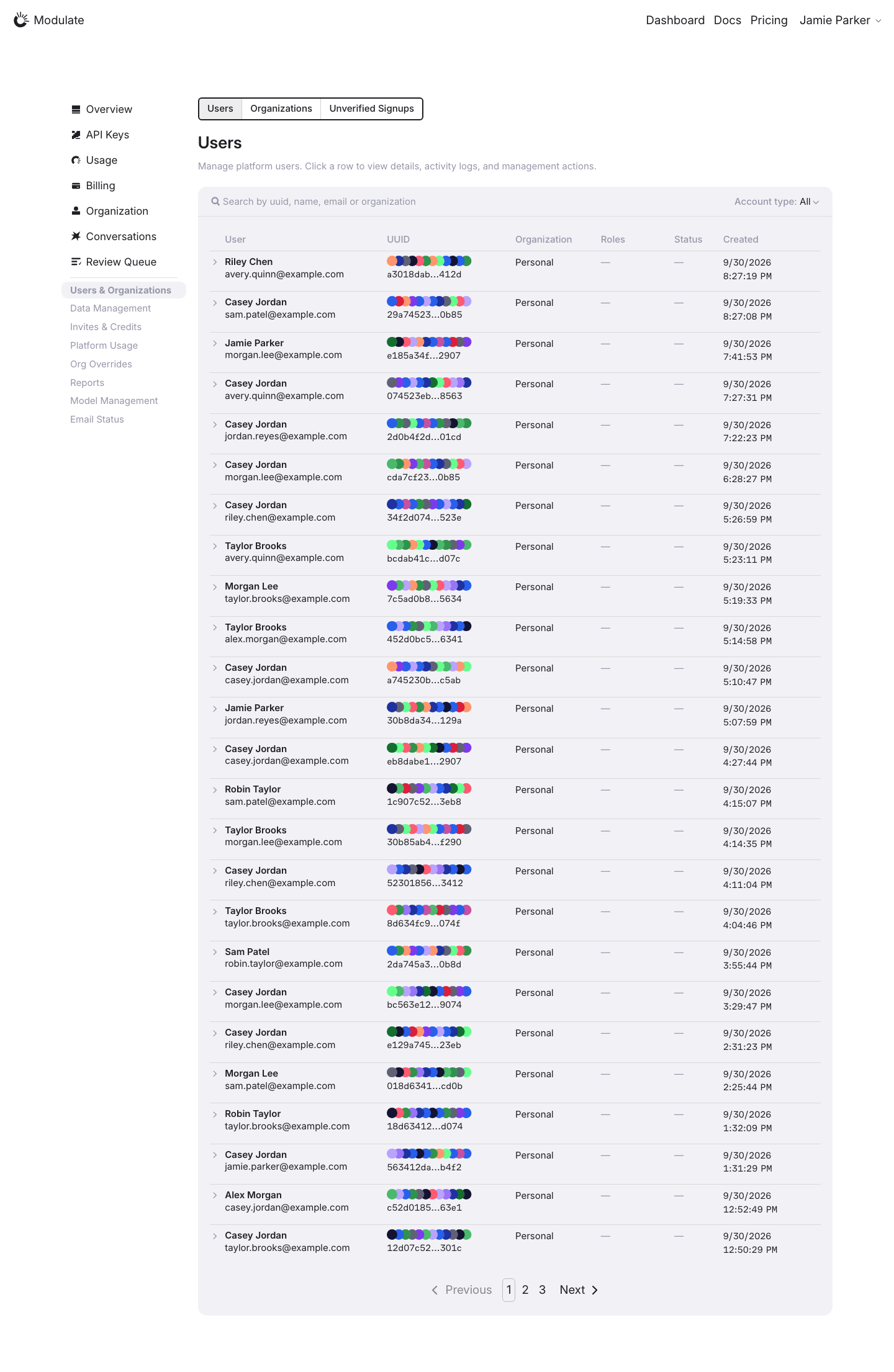
Production: Internal: Users, default
  • Test-account filter — Production uses an Account type select in the card header; the prototype uses a Show test accounts switch.
  • Table layout — Columns (User, UUID, Organization, Roles, Status, Created), row chevrons and the combined name / email cell now match the prototype. Production paginates the list.
View data diff

Production contains live records and pagination; the prototype contains a small fixture dataset. Names, record counts and values are not design defects. Row details were not opened in this comparison.

Personal and confidential values are replaced with synthetic examples in the page before capture; charts and aggregate figures are shown unchanged. Compare layout and controls only; replacement text and values are not design defects.

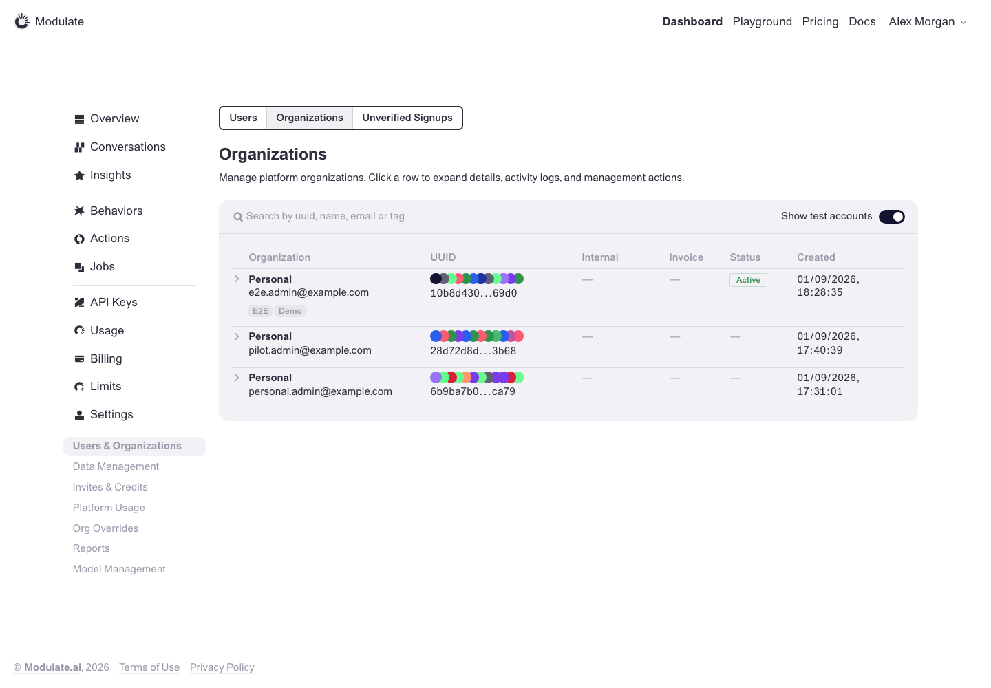
Internal: Organizations
Prototype: Internal: Organizations, default

Prototype changed. Capture again to compare.

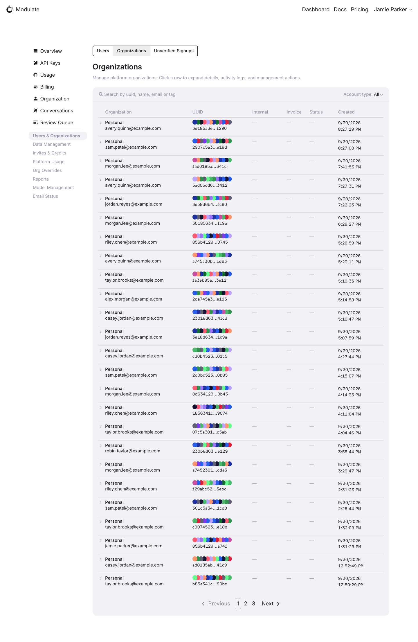
Production: Internal: Organizations, default
  • Test-account filter — Production uses an Account type select in the card header; the prototype uses a Show test accounts switch.
  • Table layout — Columns (Organization, UUID, Internal, Invoice, Status, Created) and row chevrons now match the prototype. Production paginates the list.
View data diff

Production contains live records and pagination; the prototype contains a small fixture dataset. Names, record counts and values are not design defects. Row details were not opened in this comparison.

Personal and confidential values are replaced with synthetic examples in the page before capture; charts and aggregate figures are shown unchanged. Compare layout and controls only; replacement text and values are not design defects.

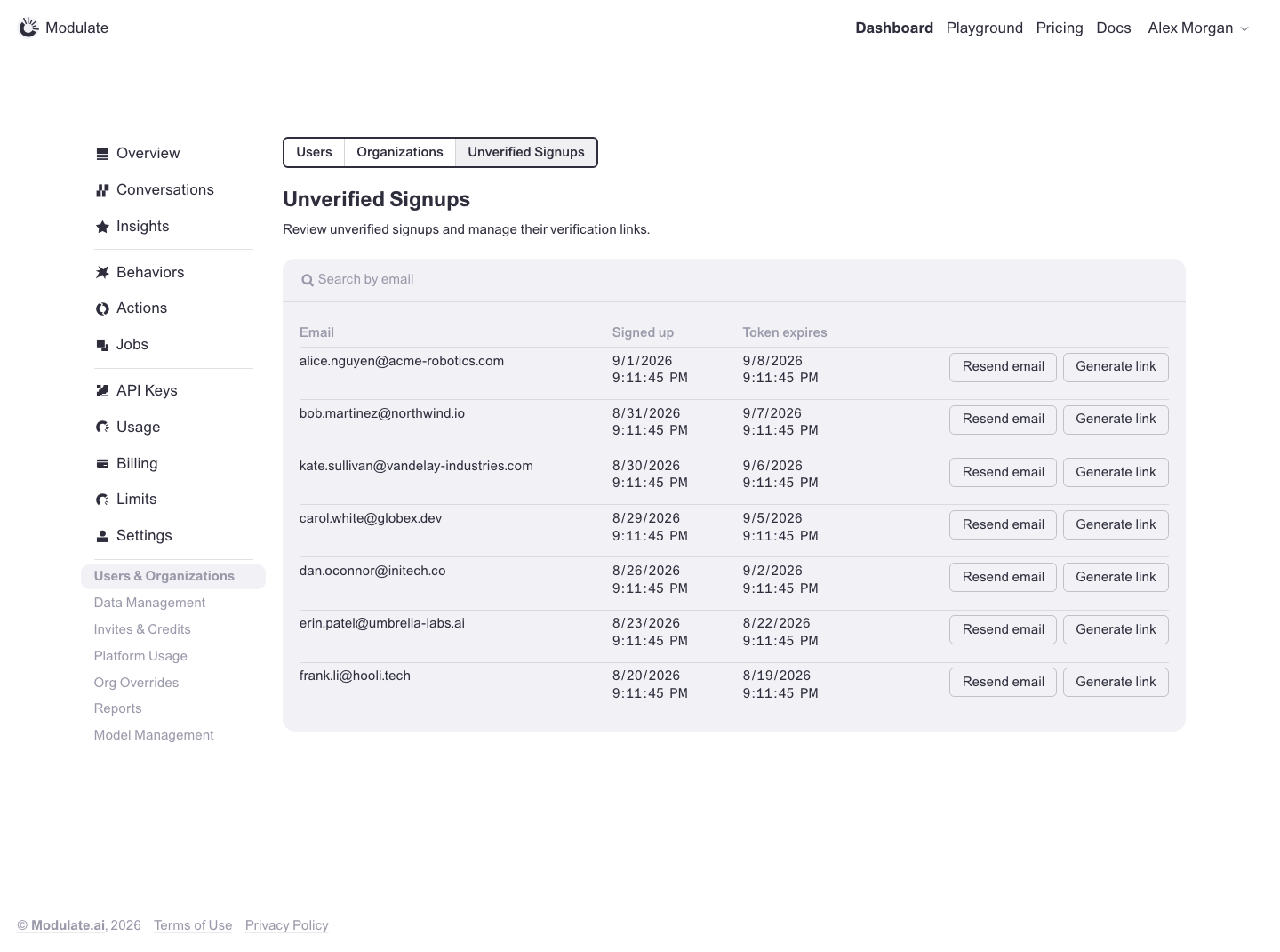
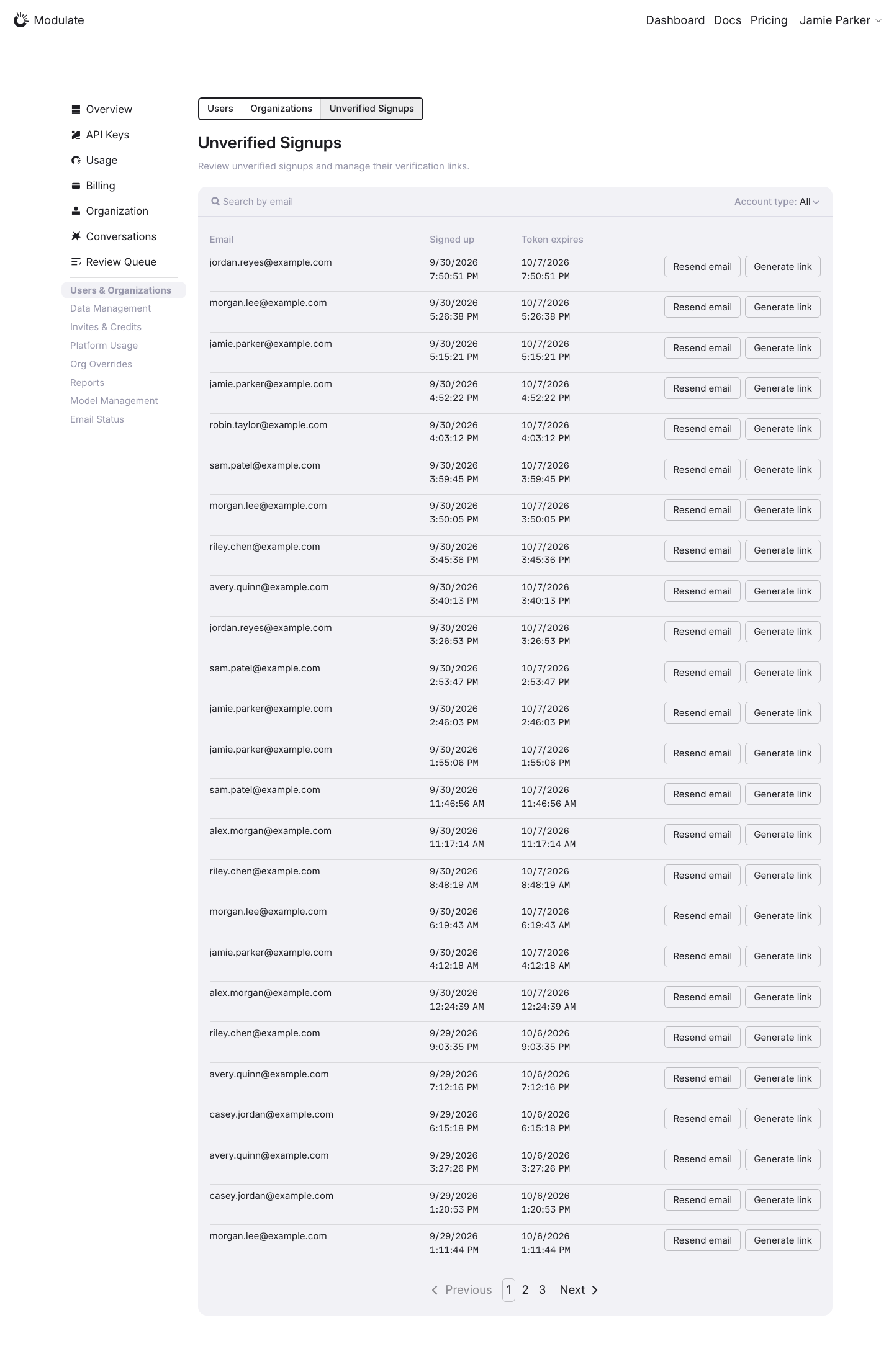
Internal: Unverified Signups
Prototype: Internal: Unverified Signups, default

Prototype changed. Capture again to compare.

Production: Internal: Unverified Signups, default
  • Account type filter — Production adds an Account type select beside the email search; the prototype has search only.
  • Table layout — Email, Signed up and Token expires columns with Resend email / Generate link actions match the prototype. Production paginates the list.
View data diff

Production and prototype contain different records; counts and dates are data differences.

Personal and confidential values are replaced with synthetic examples in the page before capture; charts and aggregate figures are shown unchanged. Compare layout and controls only; replacement text and values are not design defects.

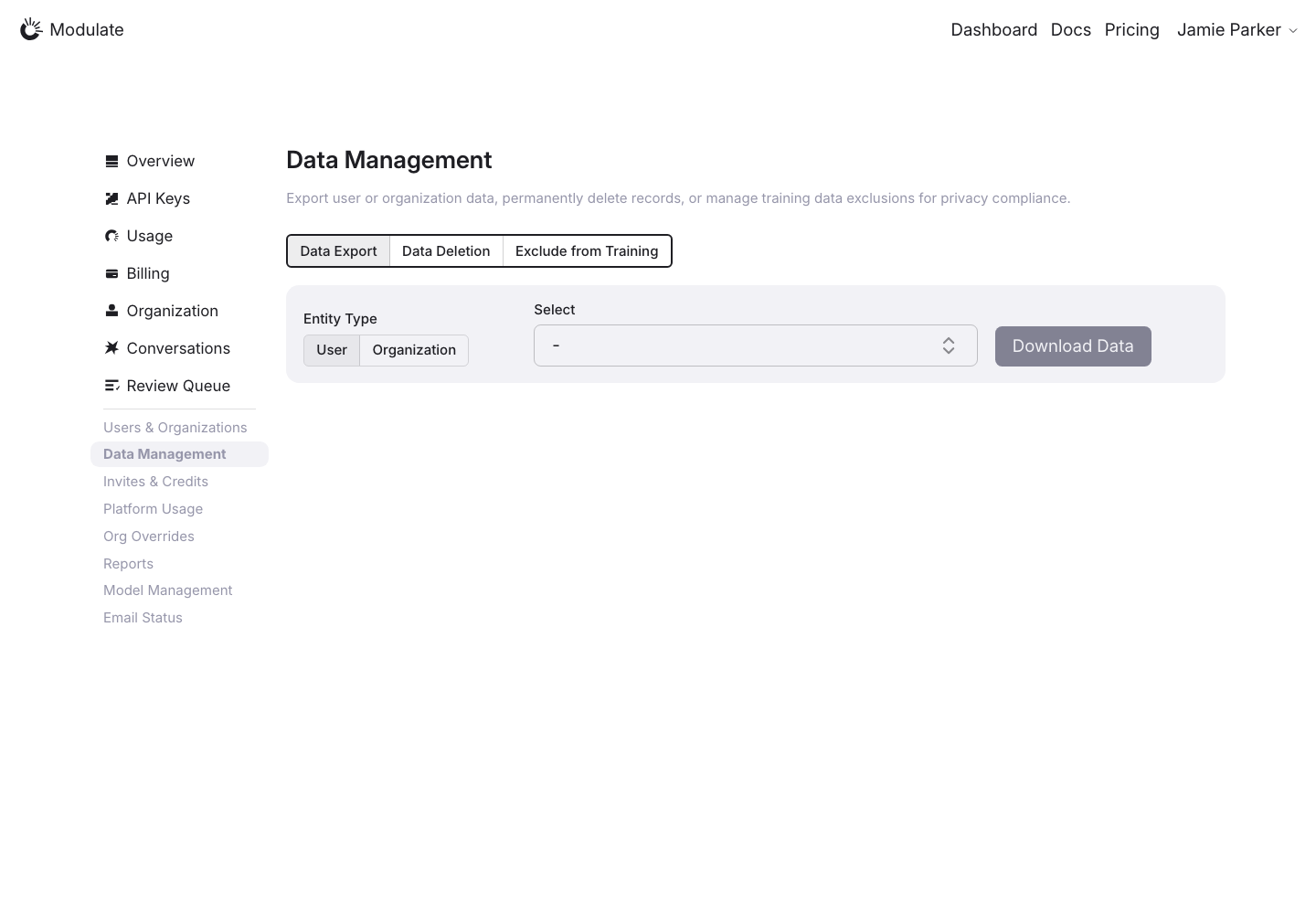
Data Management: Export
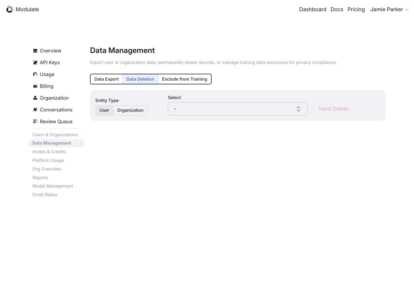
Data Management: Deletion
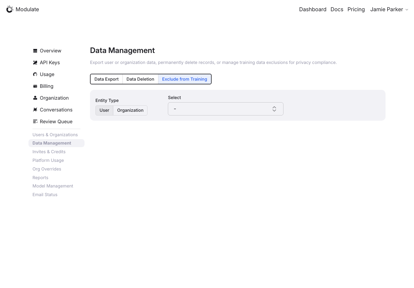
Data Management: Exclude from Training
Invites & Credits: Invites
Invites & Credits: Credit Codes
Platform Usage
Org Overrides
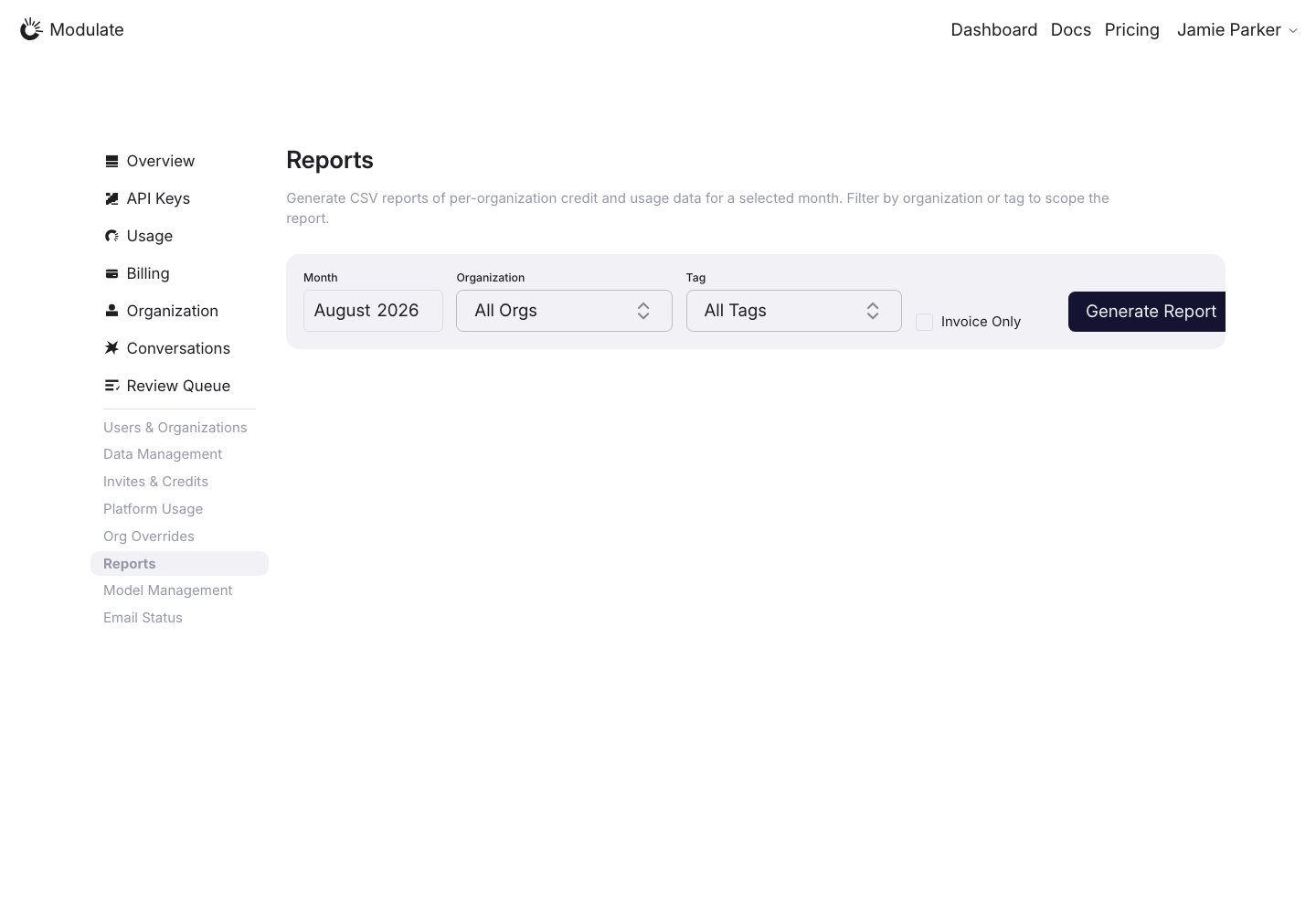
Reports
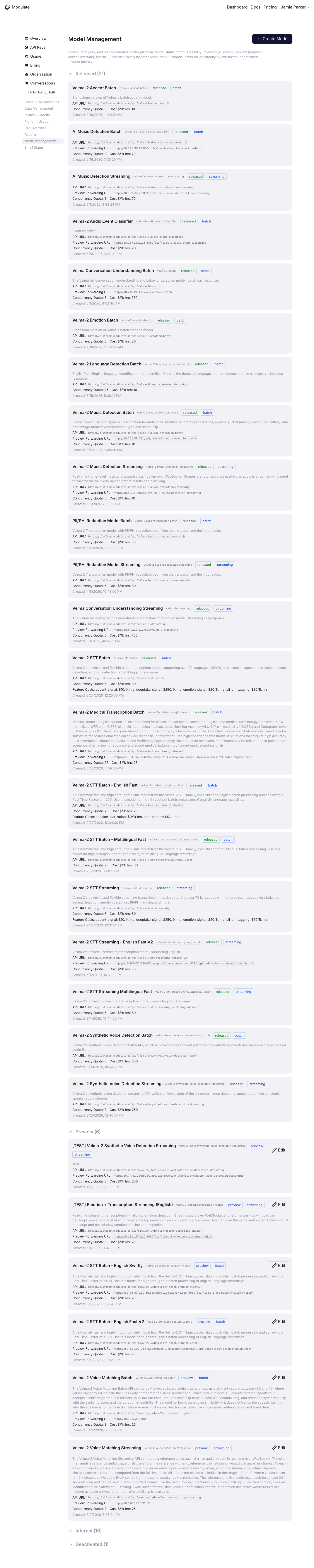
Model Management
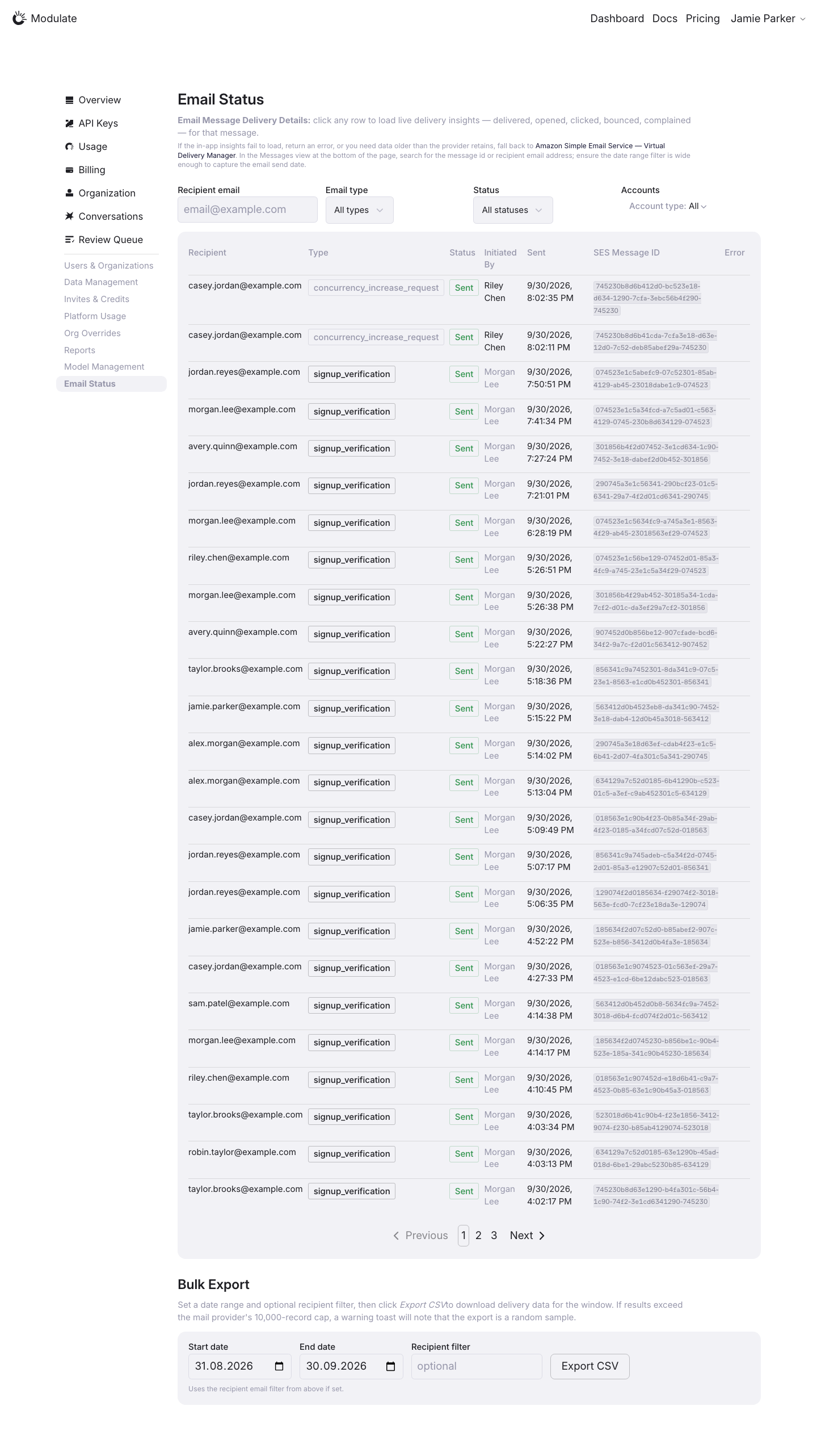
Email Status
Admin APIs

—

—

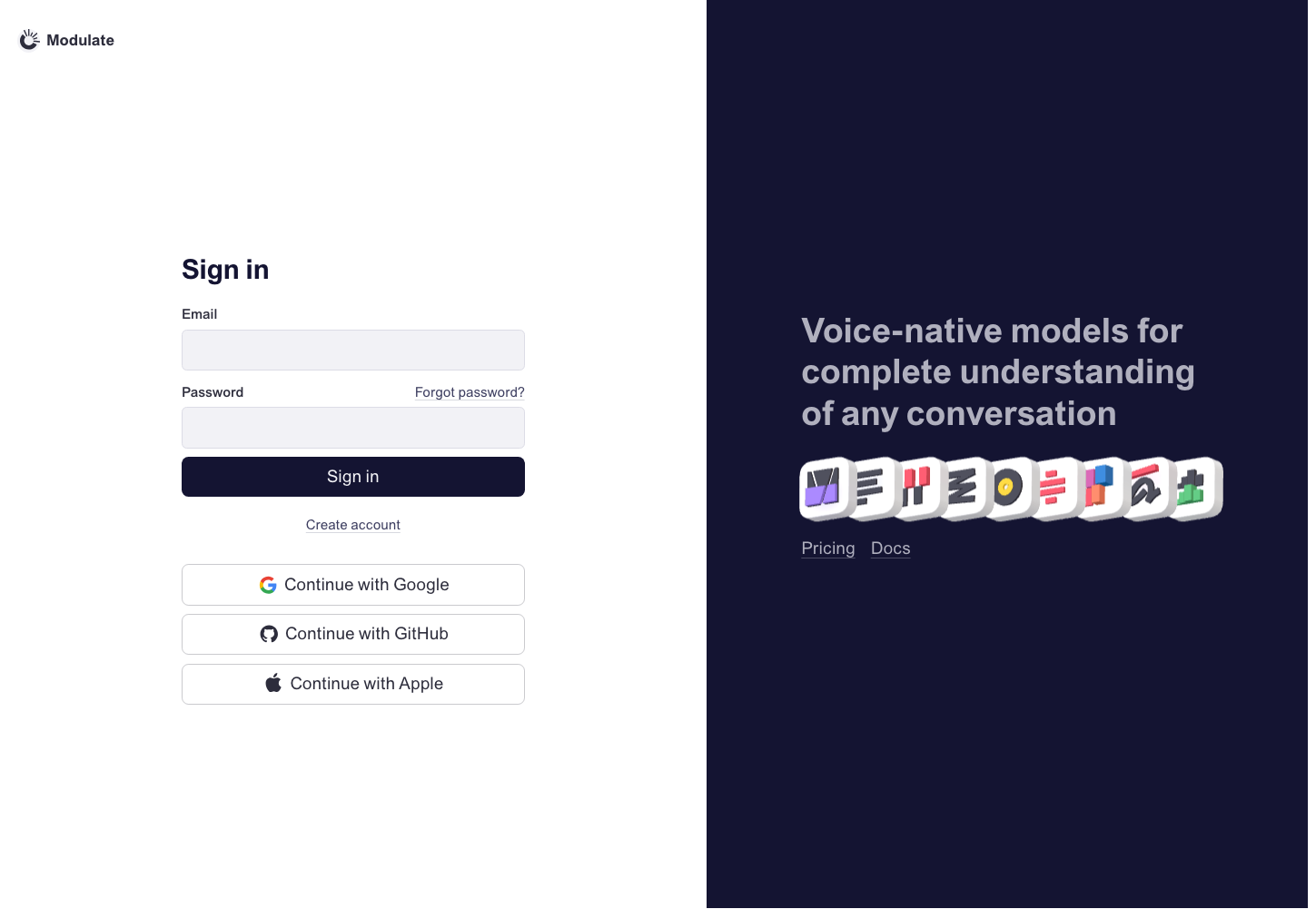
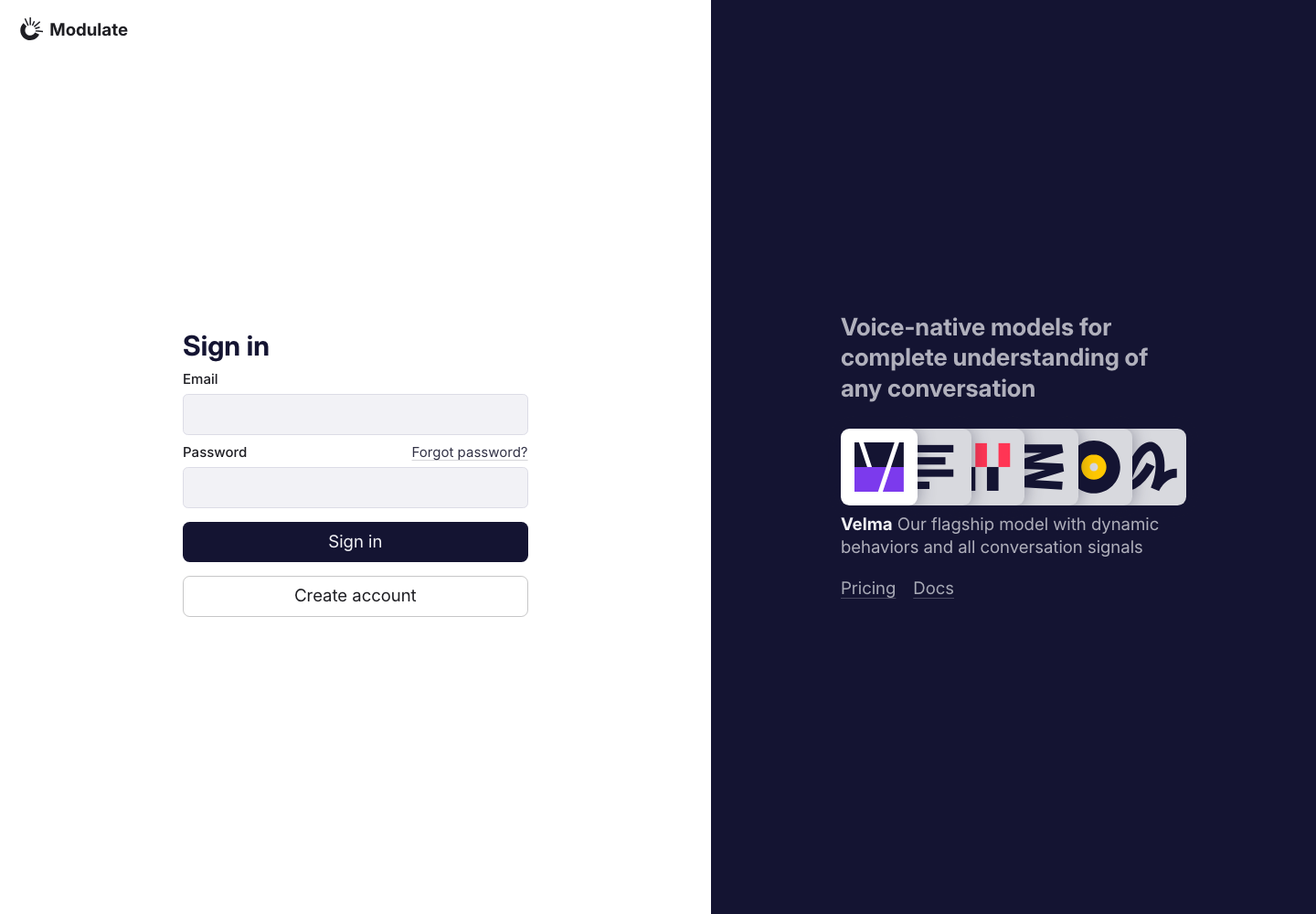
Sign in
Prototype: Sign in, default

Prototype changed. Capture again to compare.

Production: Sign in, default
  • Social sign-in — The Google, GitHub and Apple sign-in buttons shown in the prototype are absent from production.
  • Create account — Production shows an outlined full-width button below Sign in; the prototype uses a text link.
  • Promotional panel — Production uses a smaller headline and flat model icons with a model description below them. The prototype uses larger headline text and 3D model icons. Both link to Pricing and Docs.
View data diff

Initial form with empty fields. No credentials or personal data are included.

Captured 30 September 2026 with field replacement before rendering; names, emails, organizations, IDs and account values use synthetic values.

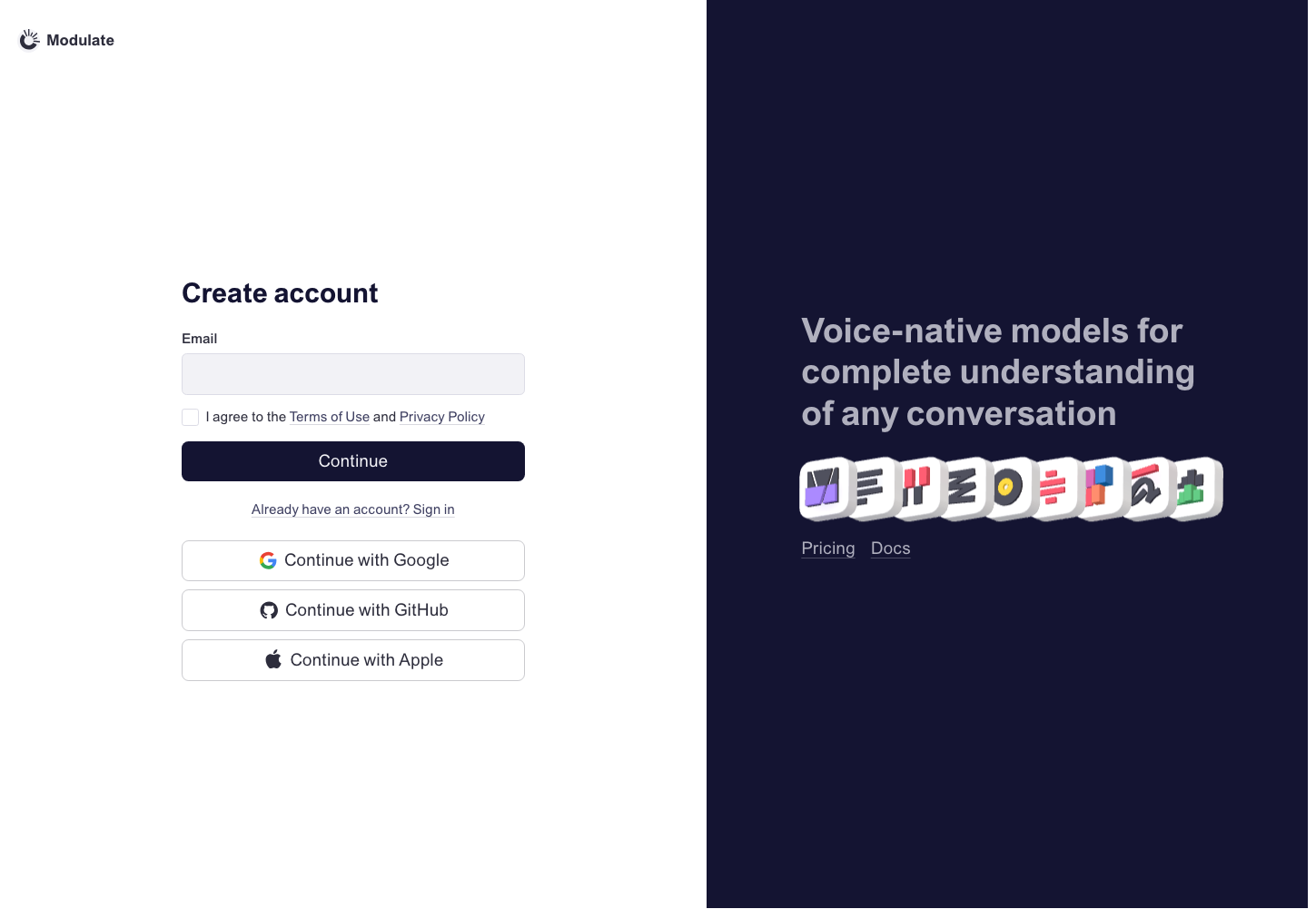
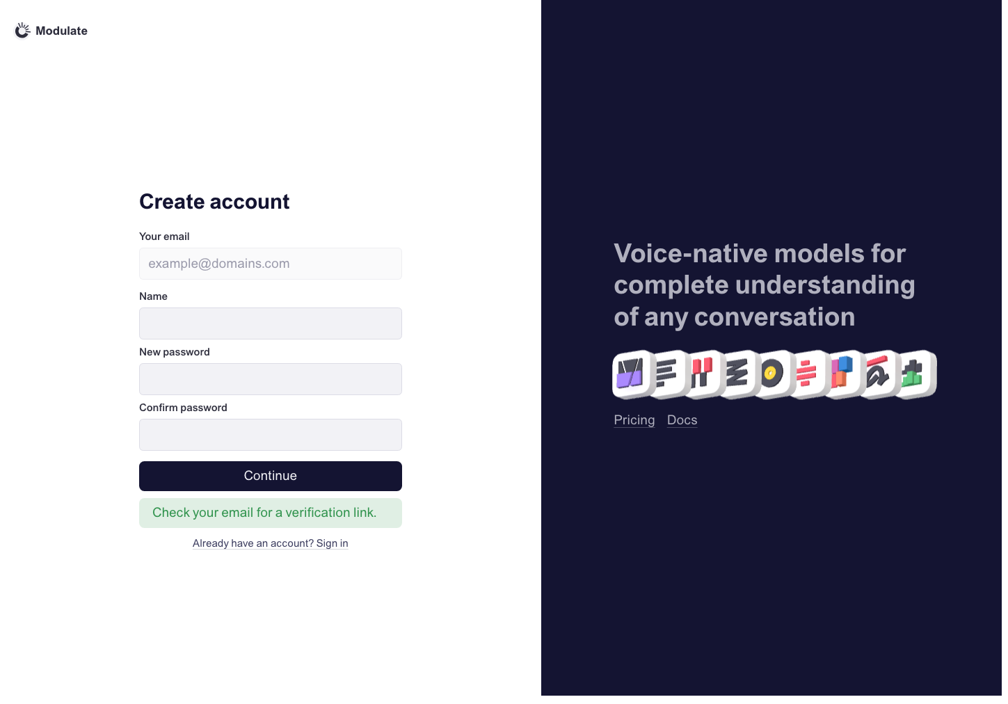
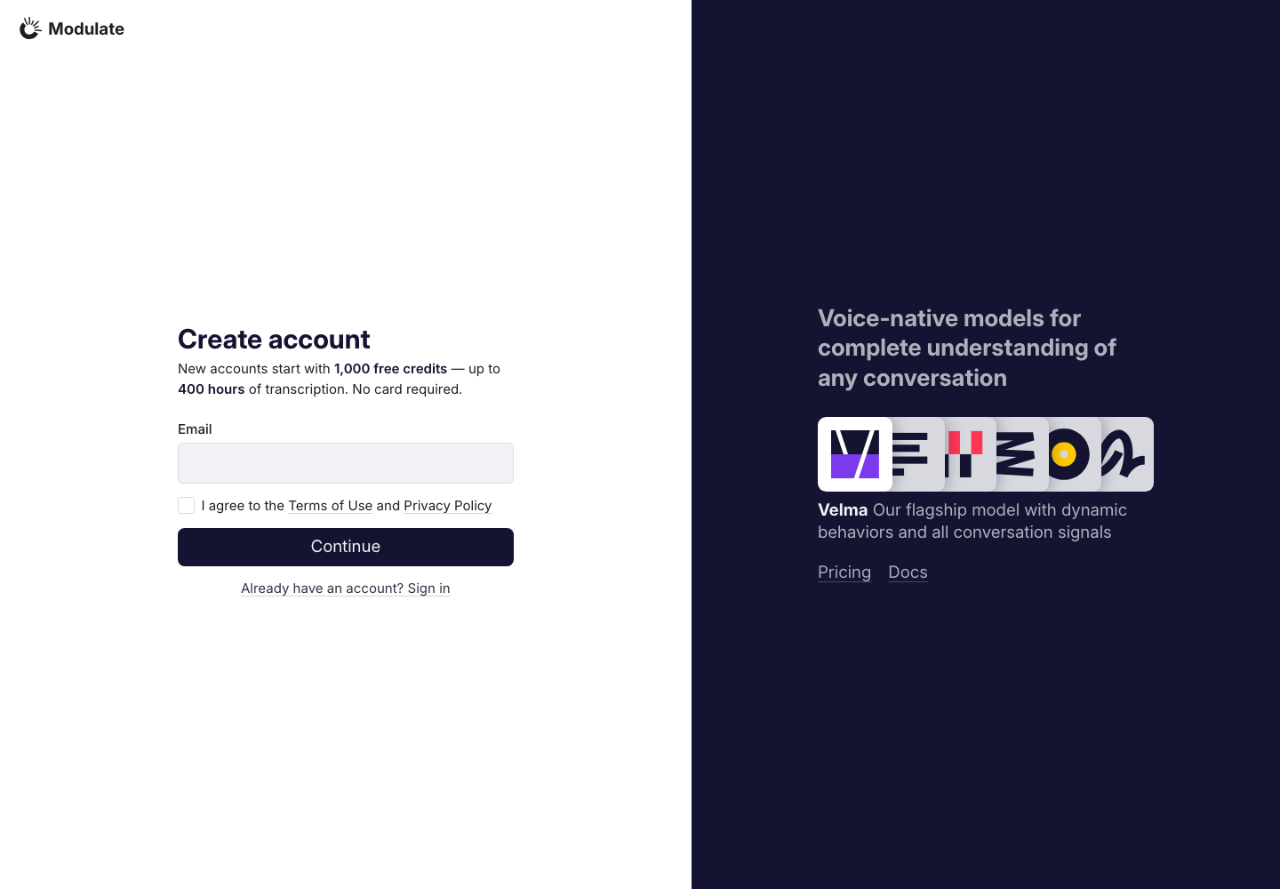
Create account
Prototype: Create account, default

Prototype changed. Capture again to compare.

Production: Create account, default
  • Introductory offer — Production adds a free-credits and transcription-hours message between the heading and email field; the prototype has no introductory offer.
  • Social sign-up — The Google, GitHub and Apple buttons shown below the prototype form are absent from production.
  • Promotional panel — Production uses a smaller headline and flat model icons with a model description below them. The prototype uses larger headline text and 3D model icons. Both link to Pricing and Docs.
View data diff

Initial form with empty fields. No credentials or personal data are included.

Captured 30 September 2026 with field replacement before rendering; names, emails, organizations, IDs and account values use synthetic values.

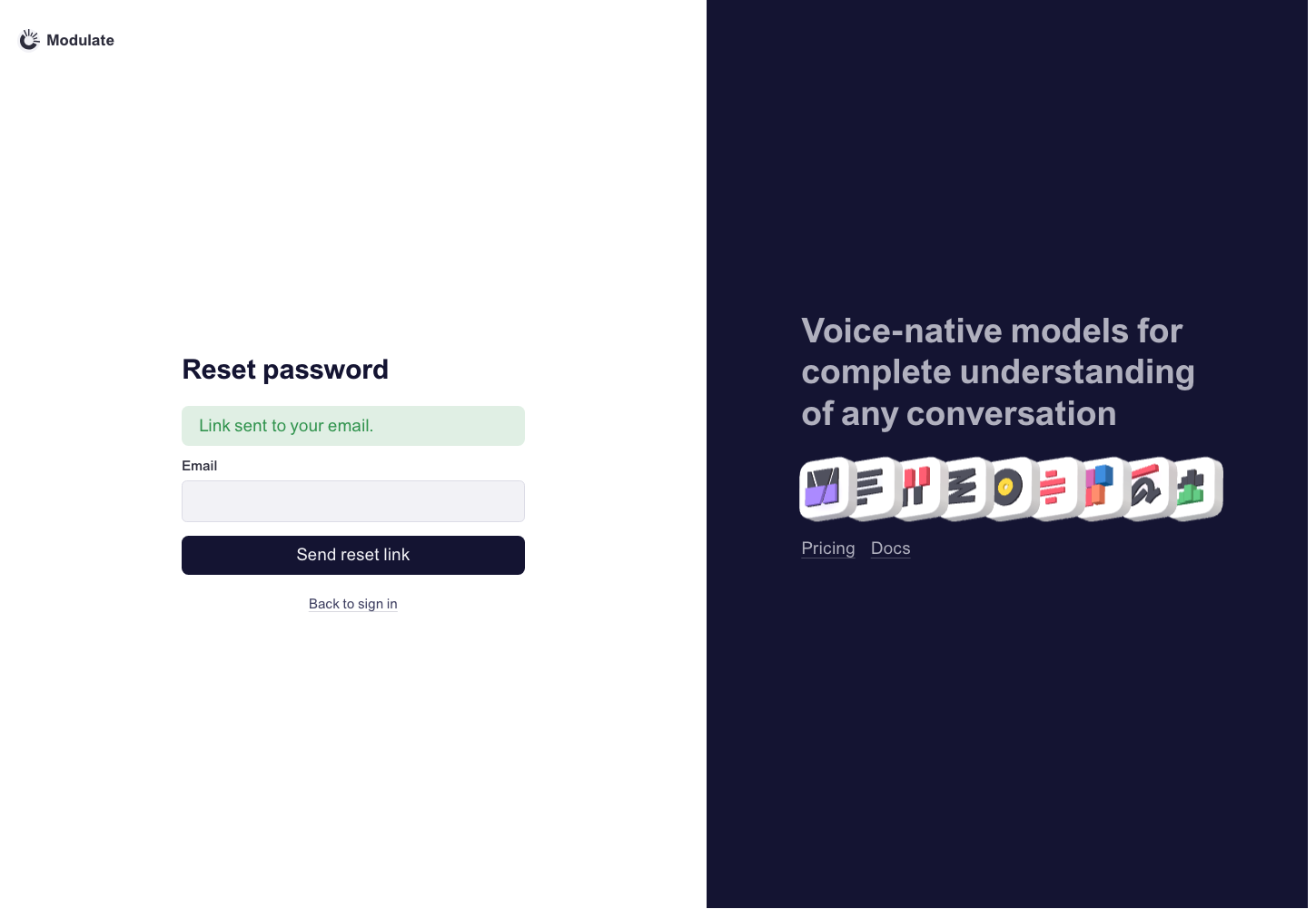
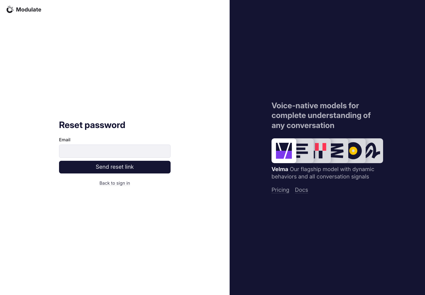
Reset password
Prototype: Reset password, default

Prototype changed. Capture again to compare.

Production: Reset password, default
  • Promotional panel — Production uses a smaller headline and flat model icons with a model description below them. The prototype uses larger headline text and 3D model icons. Both link to Pricing and Docs.
View data diff

Production shows the initial form. The prototype displays a “Link sent to your email” success notice alongside the form. These are different states; no reset email was requested.

Captured 30 September 2026 with field replacement before rendering; names, emails, organizations, IDs and account values use synthetic values.

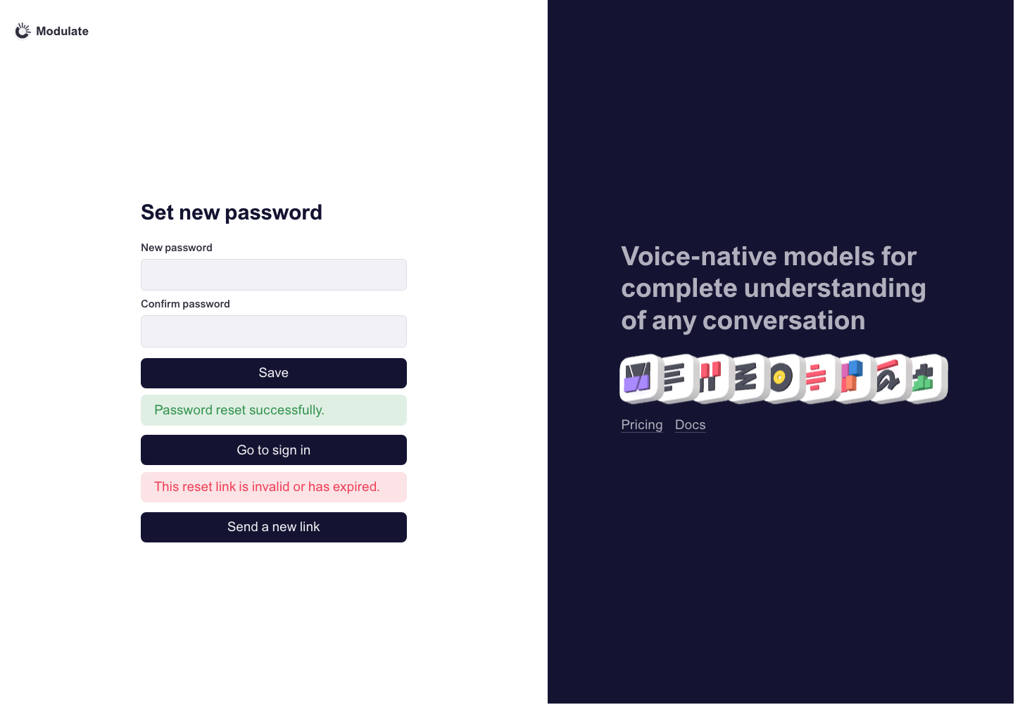
Set new password
Prototype: Set new password, default

Prototype changed. Capture again to compare.

—

Create account
Prototype: Create account, default

Prototype changed. Capture again to compare.

—

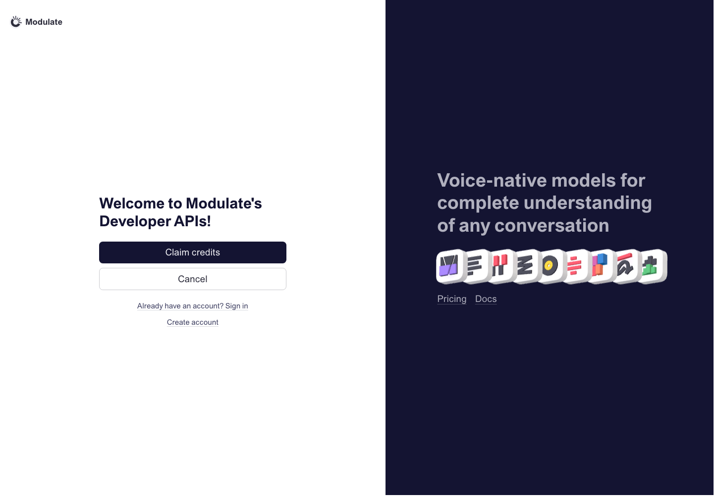
Accept invite
Prototype: Accept invite, default

Prototype changed. Capture again to compare.

—

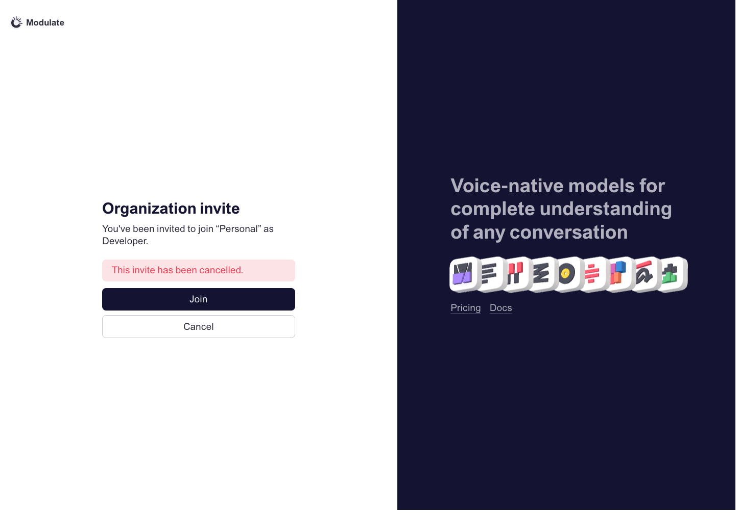
Organization invite
Prototype: Organization invite, default

Prototype changed. Capture again to compare.

—

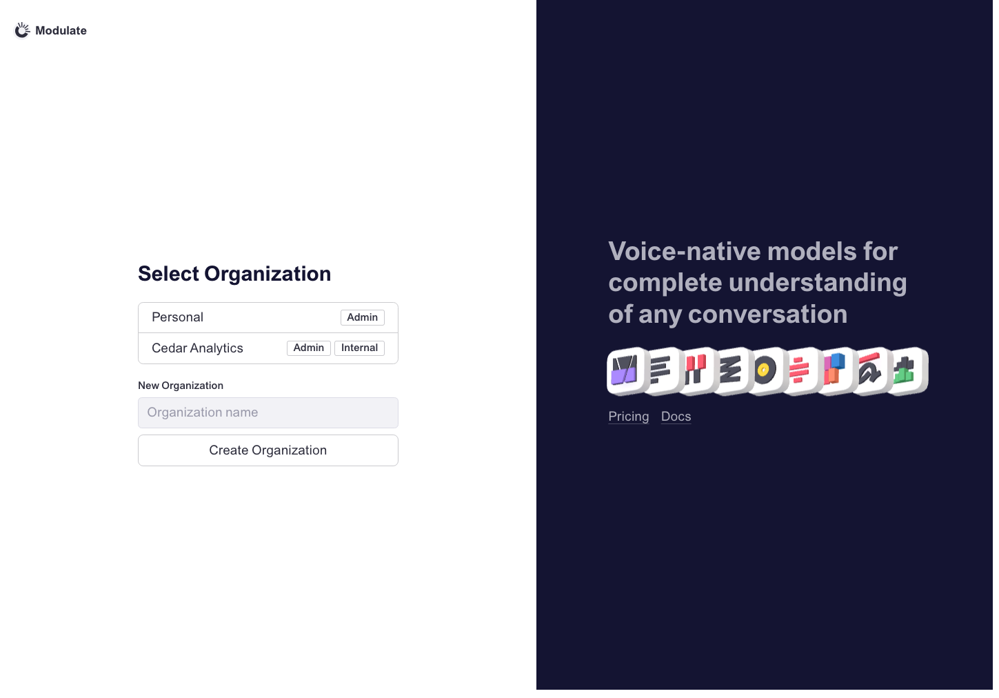
Select organization
Prototype: Select organization, default

Prototype changed. Capture again to compare.

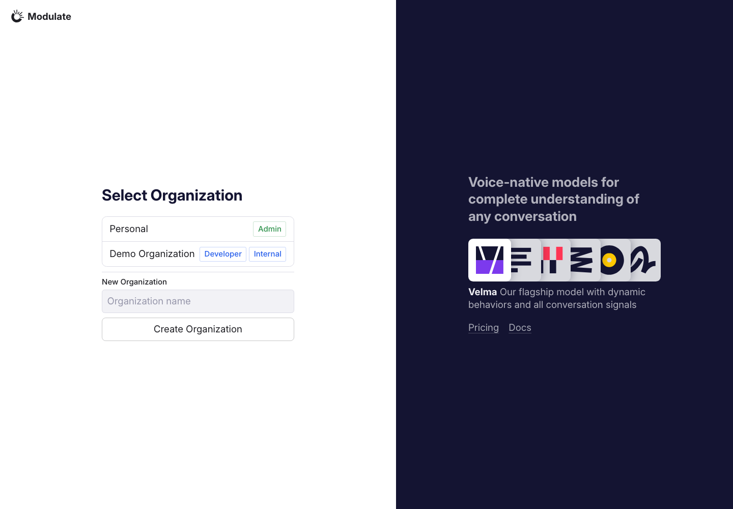
Production: Select organization, default
  • Organization rows and role badges — Production rows are taller and use larger colored role badges. The prototype uses compact neutral badges.
  • New Organization section — Production adds a horizontal divider between the organization list and creation form; the prototype separates them with whitespace.
  • Promotional panel — Production uses a smaller headline and flat model icons with a model description below them. The prototype uses larger headline text and 3D model icons. Both link to Pricing and Docs.
View data diff

Organization names are synthetic in both screenshots. Roles belong to different datasets and are not design defects.

Captured 30 September 2026 with field replacement before rendering; names, emails, organizations, IDs and account values use synthetic values.

Billing: Top-up

—

—

Components

ComponentPrototypeProduction
Pagination

—

  • To do: Pagination — Create the DS pagination component: Previous / Next controls, page numbers, current-page styling and disabled states. Use the production example as a functional reference.
Production: Pagination, default
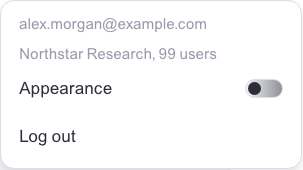
Header: Account menu
Prototype: Header: Account menu, default

Prototype changed. Capture again to compare.

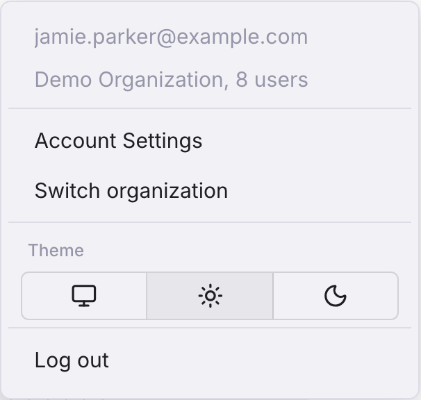
  • To do: Theme selector — Add System / Light / Dark selection as in production instead of the current two-state Appearance toggle.
  • To do: Organization switcher — Add an explicit organization switching action, matching the production Switch organization entry.
Production: Header: Account menu, default
  • Account navigation — Production adds separate Account Settings and Switch organization rows. The prototype links directly from the email and organization rows.
  • Theme control — Production uses a Theme section with System / Light / Dark icon buttons. The prototype uses one Appearance row with a compact toggle.
  • Menu surface and spacing — Production uses a tinted menu surface, larger internal spacing and separators between sections. The prototype has a compact white menu without these section dividers.
View data diff

Both sides are element captures of the open menu; production at DPR 2, prototype at DPR 1. No pixel score or measured size comparison is assigned.

Captured 30 September 2026 with field replacement before rendering; names, emails, organizations, IDs and account values use synthetic values.